Leaves Donut Chart – Fresh Approach to Data Visualization
RJ0600091_25
- Last Update 07/15/2025
- File Size 0.1MB
- # of Slides 2
- File Format PPTX
- Slide Ratio 16:9
- Color
Keywords
- #Content-Based Slides
- #Design-Based Slides
- #Product/Service Introduction
- #Market and Competitor Analysis
- #Diagram
- #Graph
- #Development Status
- #Market Status
- #Cluster
- #Circles
- #Closed Cluster Diagram
- #Doughnut Chart
- #16:9
- #donut chart PowerPoint
- #pie chart slide template
- #data visualization presentation
- #ratio chart design
- #how to create donut chart in PowerPoint
About the Product
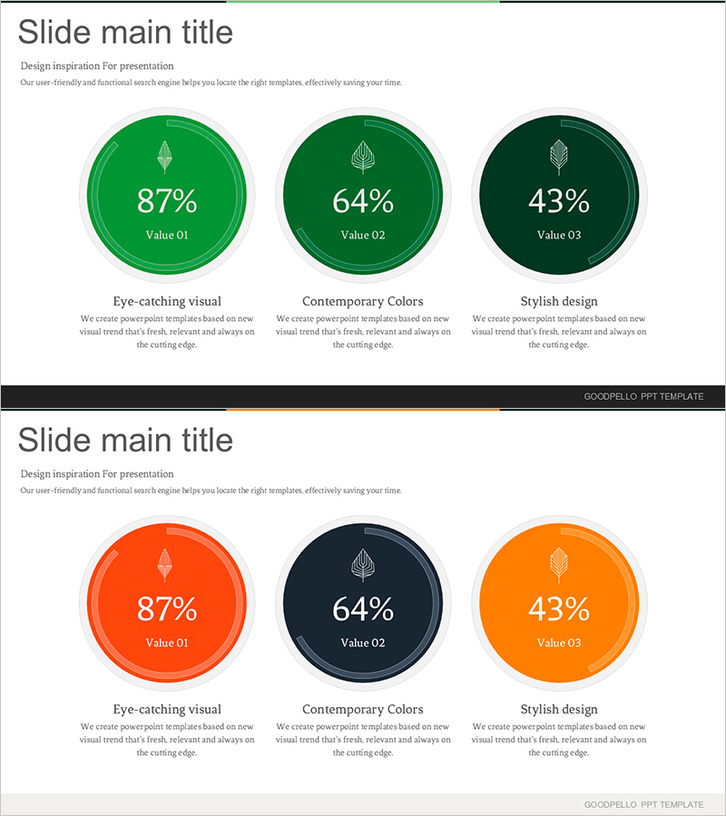
A 2-slide set featuring donut-shaped charts with leaf icons centered in green, orange, and dark navy tones. Each chart visualizes three data series (87%, 64%, 43%) as circular proportions with descriptive text areas below. Perfect for PowerPoint presentations on market overview, product introduction, and performance analysis. Delivered in 16:9 widescreen PPTX format with fully editable colors, values, and text fields for seamless customization.
Usage Points
-
Main Usage
Visually emphasize proportional data using donut-shaped charts. Effectively compare 3-4 categories such as market share, customer composition, product category distribution, or performance achievement rates at a glance. Leaf icons convey a fresh, nature-inspired brand image.
-
How to Use
Insert into business plans, product brochures, or marketing presentations within market analysis, customer analysis, or performance reporting sections. Customize percentage values and labels to match your presentation data. Adjust colors to align with corporate branding. Use both slides consecutively or select individual slides as needed.
-
Recommended For
Ideal for marketing, sales, and planning professionals delivering data-driven presentations. Suitable for market analysis, customer segmentation, product portfolio composition, budget allocation, and performance achievement reporting. Enhances credibility when presenting to executives, investors, and clients.
-
Slide Structure
2-slide composition. Each slide features a title area at top, centered donut chart displaying 3 data series in the middle, and descriptive text area at bottom. First slide uses green tones; second uses orange and navy tones, allowing flexible representation of multiple data sets.
Related Products
-

Graph of User Status Analysis by Age Group
#Market and Competitor Analysis #Diagram #Graph
-

Market Share Donut Pie Chart – Insightful Data Visualization
#Product/Service Introduction #Diagram #Graph
-

Visually Appealing Presentation Slide – Stylish Design
#Product/Service Introduction #Market and Competitor Analysis #Graph
-

Natural Recreation Area Preference Chart – Market Status Analysis
#Market and Competitor Analysis #Diagram #Graph
