Alimony Ranking Graph – Visualizing Financial Performance
RJ0600076_21
- Last Update 07/10/2025
- File Size 0.8MB
- # of Slides 2
- File Format PPTX
- Slide Ratio 16:9
- Color
Keywords
- #Content-Based Slides
- #Design-Based Slides
- #Financial Plans and Performance
- #Graph
- #Other
- #Projected Return on Investment (ROI)
- #Sales and Revenue
- #Circles
- #Doughnut Chart
- #16:9
- #donut chart PowerPoint
- #ranking graph slide template
- #financial performance visualization
- #multi-layer data chart
- #circular graph PPT download
About the Product
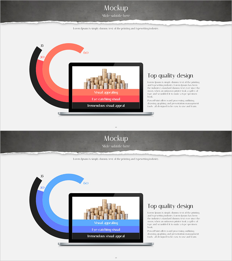
A donut-shaped ranking chart PowerPoint slide designed for financial planning and performance analysis. This presentation template features a multi-color donut chart in coral red and blue tones, displaying three-layer data simultaneously through a radial structure that expands from the central node to outer rings. The 2-slide set enables intuitive comparison of financial metrics such as revenue, investment, and allocations across hierarchical levels. Each slide is fully editable and ready to integrate into financial reports, performance presentations, and investor briefings.
Usage Points
-
Main Usage
Visualize multi-layered financial data including revenue, investment status, and allocations by displaying rank and proportion simultaneously. The radial structure expanding from a central node communicates information hierarchically, from core metrics to detailed items. Ideal for financial reports, performance presentations, and investor relations meetings where complex quantitative data requires clear visual communication.
-
How to Use
Enter financial category names and values into each donut ring layer, then adjust colors to differentiate categories. Add key messages or time periods in the central node area, and include detailed explanations in the right-side text box. Optimized for 16:9 widescreen format, the slide works seamlessly in corporate presentations, online meetings, and printed materials.
-
Recommended For
Finance teams, investor relations (IR) professionals, executives, consultants, and data analysts who need to explain complex financial metrics. Particularly suited for quarterly and annual performance reports, investor pitch meetings, executive briefings, and consulting proposals based on quantitative data-driven decision-making.
-
Slide Structure
Two-slide set with the first slide featuring a coral red 3-layer donut chart and the second slide displaying the same structure in blue tones. Each slide includes a central node area (labeled B, C, D), three concentric donut rings for data input, and a right-side text box for descriptive content. The design allows easy node modification and data entry while maintaining visual consistency.
Related Products
-

Key Sales Analysis Donut Chart – Visualizing Financial Performance
#Financial Plans and Performance #Graph #Other
-

Simple Circle Presentation Template Doughnut Chart – Visualizing Financial Performance
#Financial Plans and Performance #Diagram #Graph
-

Infographic Slide Representing Nepalese Coffee Bean Exports
#Financial Plans and Performance #Other #Projected Return on Investment (ROI)
-

Regional Demand Survey Graph – Key to Market Analysis
#Market and Competitor Analysis #Financial Plans and Performance #Graph
