Key Sales Analysis Donut Chart – Visualizing Financial Performance
RJ0500039_19
- Last Update 06/17/2025
- File Size 0.5MB
- # of Slides 2
- File Format PPTX
- Slide Ratio 16:9
- Color
Keywords
- #Content-Based Slides
- #Design-Based Slides
- #Financial Plans and Performance
- #Graph
- #Other
- #Projected Return on Investment (ROI)
- #Sales and Revenue
- #Circles
- #Doughnut Chart
- #16:9
- #donut chart PowerPoint
- #pie chart slide template
- #sales analysis presentation
- #financial visualization PPT
- #ratio chart slide
- #donut graph PowerPoint download
About the Product
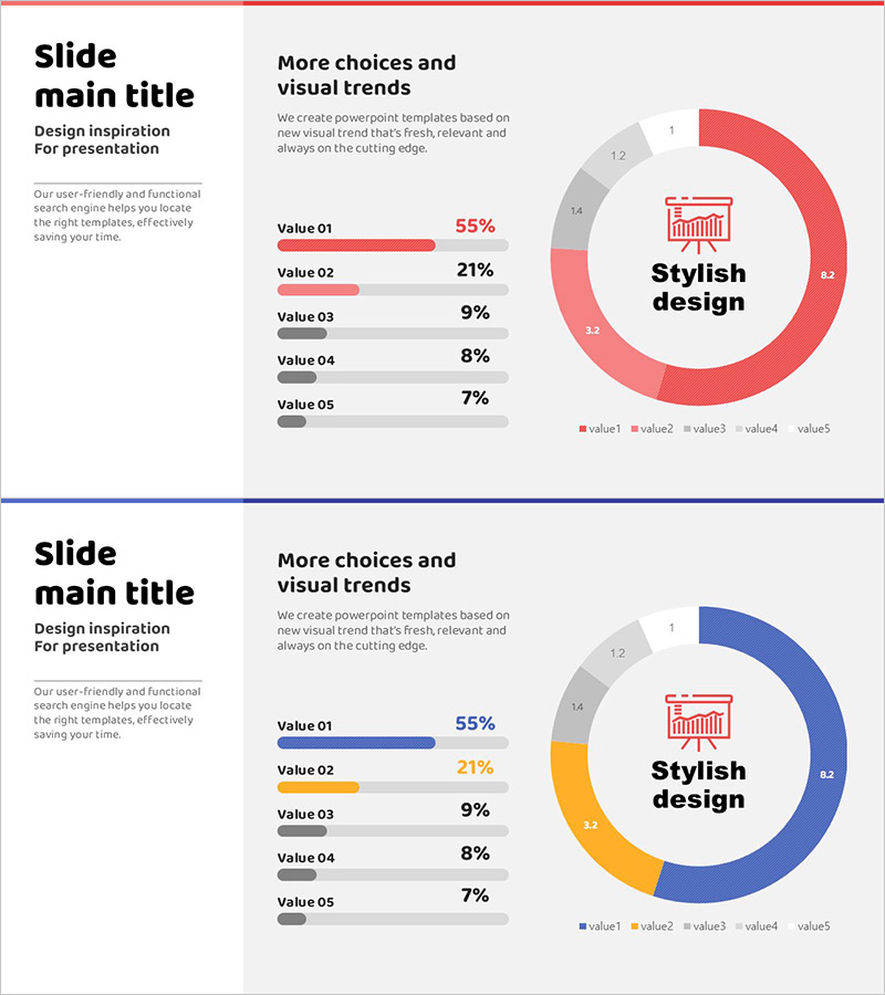
A professional donut chart PowerPoint slide designed to visualize financial performance and sales composition with five segments. The red and gray color scheme emphasizes key metrics, while a central icon and text labels communicate the core message. Paired with a horizontal bar graph for simultaneous data comparison and ratio representation. The 2-slide set accommodates various data scenarios and integrates seamlessly into financial sections of presentations, reports, and business plans for immediate use.
Usage Points
-
Main Usage
Clearly express the relationship between parts and whole—such as sales ratios, financial composition, and market share—using a donut chart. A central icon and text labels emphasize the key message to capture audience attention, while the accompanying horizontal bar graph presents numerical comparisons simultaneously.
-
How to Use
Use in financial reports, business performance presentations, investor briefings, and marketing analysis materials to represent sales composition, cost allocation, and market segmentation data. The 2-slide format allows preparation of multiple data sets, and all colors and values are fully editable to match your specific data.
-
Recommended For
Finance teams, executives, marketing managers, and business development professionals presenting quarterly results, annual reports, and investor presentations. Particularly effective for analyses requiring sales composition, cost ratios, and market share visualization.
-
Slide Structure
Slide 1: 5-segment donut chart (red primary, gray secondary) with central icon and text labels. Slide 2: Horizontal bar graph for five items (Value 01–05) with percentage values displayed. 16:9 widescreen format, PPTX file with all elements fully editable.
Related Products
-

Alimony Ranking Graph – Visualizing Financial Performance
#Financial Plans and Performance #Graph #Other
-

Simple Circle Presentation Template Doughnut Chart – Visualizing Financial Performance
#Financial Plans and Performance #Diagram #Graph
-

Abstract Pattern World Map Template – Harmony of Design and Data
#Market and Competitor Analysis #Financial Plans and Performance #Graph
-

Analyzing Your Favorite Food Mix Chart – Attractive Data Visualization
#Financial Plans and Performance #Graph #Other
