Analyzing Your Favorite Food Mix Chart – Attractive Data Visualization
RJ0800013_17
- Last Update 08/03/2025
- File Size 0.4MB
- # of Slides 2
- File Format PPTX
- Slide Ratio 16:9
- Color
Keywords
About the Product
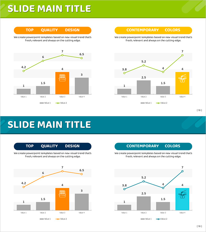
A 2-slide combination chart analysis PowerPoint template featuring mixed line and bar chart visualization. Lime green line graphs are paired with orange and gray bar charts to compare two data series simultaneously. Each slide includes a section header ('Top Quality Design' and 'Contemporary Colors'), descriptive text, and four data values (Value 1–4) displayed across both chart types. Ideal for financial reports, sales presentations, and market analysis decks where complex metrics require side-by-side comparison.
Usage Points
-
Main Usage
Compare two or more data series on the same axis to reveal correlations and trends. Line graphs show trajectory while bar charts display absolute values, supporting data-driven decision-making.
-
How to Use
Deploy in quarterly business reviews, investor pitch decks, and financial analysis presentations to illustrate relationships between metrics like revenue vs. profit margin, market share vs. growth rate, or budget vs. actual spend.
-
Recommended For
CFOs, financial analysts, marketing strategists, and business intelligence professionals presenting quantitative insights to executives. Ideal for period-over-period performance comparisons and trend analysis.
-
Slide Structure
2-slide deck. Each slide contains a rounded section header, descriptive text block, lime-green line graph overlay, orange and gray bar chart base, and four labeled data value positions for flexible data input.
Related Products
-

Alimony Ranking Graph – Visualizing Financial Performance
#Financial Plans and Performance #Graph #Other
-

Key Sales Analysis Donut Chart – Visualizing Financial Performance
#Financial Plans and Performance #Graph #Other
-

Simple Circle Presentation Template Doughnut Chart – Visualizing Financial Performance
#Financial Plans and Performance #Diagram #Graph
-

Mixed Bar Graph by Product – Visualization for Performance Maximization Strategy
#Business Strategy #Financial Plans and Performance #Graph
