Green Orange Round Bell Chart – Clear Analysis Through Data Visualization
RJ0600066_6
- Last Update 07/07/2025
- File Size 8.5MB
- # of Slides 2
- File Format PPTX
- Slide Ratio 16:9
- Color
Keywords
About the Product
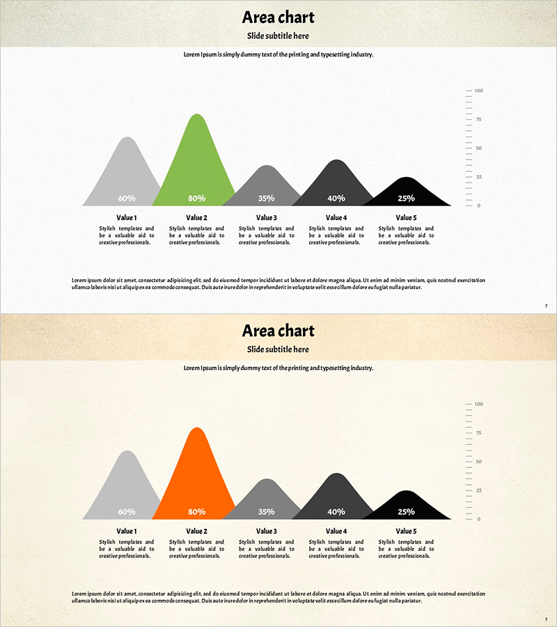
A PowerPoint slide featuring a 5-series bell curve (area chart) that visualizes distribution data and trends with green and orange tones and rounded edges. Each data series displays percentage labels for easy comparative analysis, with a Y-axis scale on the right side showing the numeric range clearly. The 2-slide set allows flexible application to various datasets and effectively communicates quantitative analysis results in presentations, reports, and proposals. Delivered as a 16:9 widescreen PPTX file ready for immediate editing and customization.
Usage Points
-
Main Usage
Visualizes quantitative data distribution patterns and trends using a bell curve structure to clearly communicate statistical analysis results. Ideal for marketing performance analysis, sales data distribution, customer satisfaction surveys, market research findings, and comparative analysis of five categories.
-
How to Use
Replace percentage values and labels in each area with your own data. Adjust the Y-axis scale on the right to match your data range. Customize the color scheme (green, orange, gray, black) to match your corporate brand colors. Duplicate the 2-slide template to compare multiple datasets side by side.
-
Recommended For
Data analysts, marketing professionals, business executives preparing reports, academic presenters, and consultants visualizing statistical analysis results. Suitable for quarterly performance reviews, customer segmentation analysis, market research presentations, risk assessments, and quantitative decision-making materials.
-
Slide Structure
2-slide set. Each slide features a 5-series bell curve area chart centered on the slide with percentage labels (60%, 80%, 35%, 40%, 25%) and descriptive text for each area. A Y-axis scale (0–100) appears on the right side, with detailed explanation text boxes arranged at the bottom for each data series.
Related Products
-

Competitiveness Analysis in Agriculture - Vertical Bar Chart
#Market and Competitor Analysis #Graph #Competitor Analysis
-

Market Share Analysis with Pie Chart – Precise Data Visualization
#Company Introduction #Market and Competitor Analysis #Graph
-

User Analysis Graph by Age Group – Advanced Data Insights
#Market and Competitor Analysis #Diagram #Graph
-

Sales and Promotion Impact on Financials – Data Visualization
#Marketing Plan and Strategy #Financial Plans and Performance #Graph
