Experimental Results Analysis Data Graph – A New Level of Data Visualization
RJ0700026_10
- Last Update 07/29/2025
- File Size 1MB
- # of Slides 2
- File Format PPTX
- Slide Ratio 16:9
- Color
Keywords
- #Content-Based Slides
- #Design-Based Slides
- #Product/Service Introduction
- #Market and Competitor Analysis
- #Graph
- #Development Status
- #Market Share
- #Circles
- #Doughnut Chart
- #16:9
- #doughnut chart PowerPoint
- #pie chart slide template
- #ratio data visualization
- #3-item comparison graph
- #data analysis presentation
- #donut chart download
About the Product
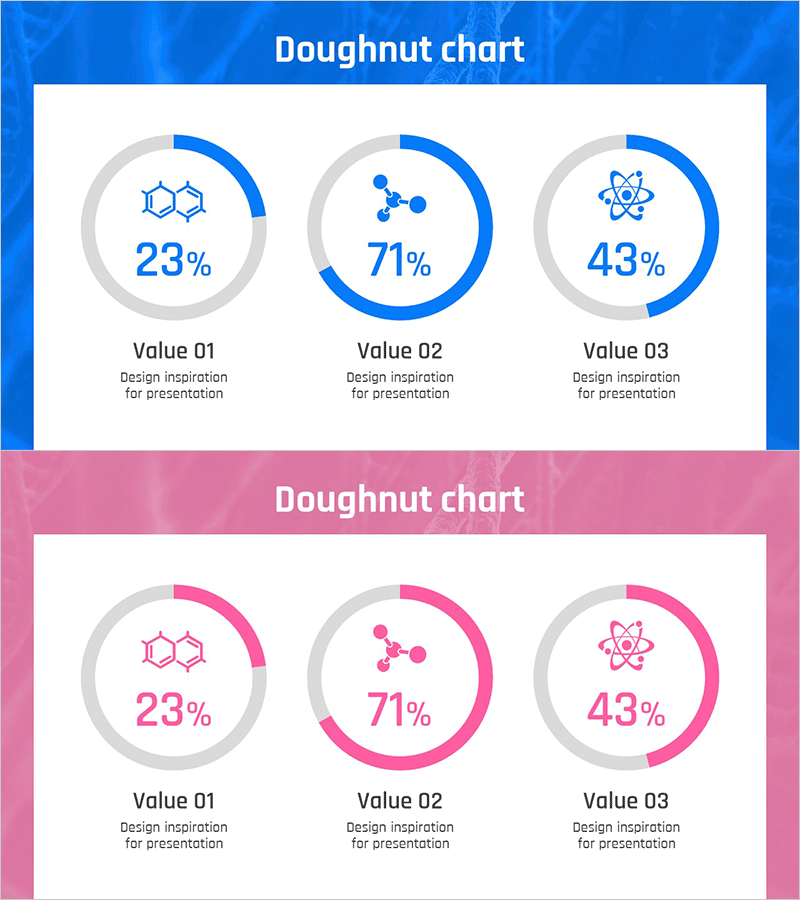
A doughnut chart PowerPoint slide template designed to visualize ratio data for experimental results, market research, and statistical analysis. The 2-slide set includes a blue version and a pink version, each featuring three doughnut-shaped pie charts arranged horizontally. Each chart displays a percentage value in the center with item labels and description text fields below, enabling immediate use in data-driven presentations. The 16:9 widescreen PPTX format is compatible with all PowerPoint versions for easy editing and customization.
Usage Points
-
Main Usage
Visualize three-item ratio data such as experimental results, market survey statistics, product performance comparisons, and customer satisfaction ratings. The centered percentage values and bottom labels enable clear information delivery, making this template ideal for emphasizing key statistics in the data section of presentations.
-
How to Use
Replace the center percentage values with your actual data and edit the 'Value 01·02·03' labels and 'Design inspiration for presentation' descriptions with your item names and content. Use the blue version for technical and scientific presentations, and the pink version for marketing and consumer research presentations to maintain visual consistency.
-
Recommended For
Recommended for data analysts, marketing professionals, researchers, consultants, and planners who need to explain quantitative data-based decisions. Particularly suitable for business reports, marketing plans, research presentations, and investor pitch decks requiring three-item ratio comparisons.
-
Slide Structure
2-slide set with three doughnut charts arranged horizontally on each slide. Each doughnut consists of a gray background circle and a colored arc segment, with a percentage value displayed in the center, icons (hexagon, molecular structure, atom symbol) at the top, and item label and description text fields at the bottom. The first slide uses blue tones while the second slide uses pink tones for color differentiation.
Related Products
-

Analysis of Work Progress – Utilizing Pie Chart
#Product/Service Introduction #Market and Competitor Analysis #Graph
-

Business Idea Development Status Graph – Ideas and Growth
#Product/Service Introduction #Market and Competitor Analysis #Graph
-

Sales Status Analysis Graph – Simple and Stylish Design
#Product/Service Introduction #Market and Competitor Analysis #Graph
-

City Theme Market Share Graph – Business Data Visualization
#Product/Service Introduction #Market and Competitor Analysis #Graph
