Graph Trend by Instrument Session – Competitive Analysis Visualization
RJ0800041_17
- Last Update 08/11/2025
- File Size 0.4MB
- # of Slides 2
- File Format PPTX
- Slide Ratio 16:9
- Color
Keywords
About the Product
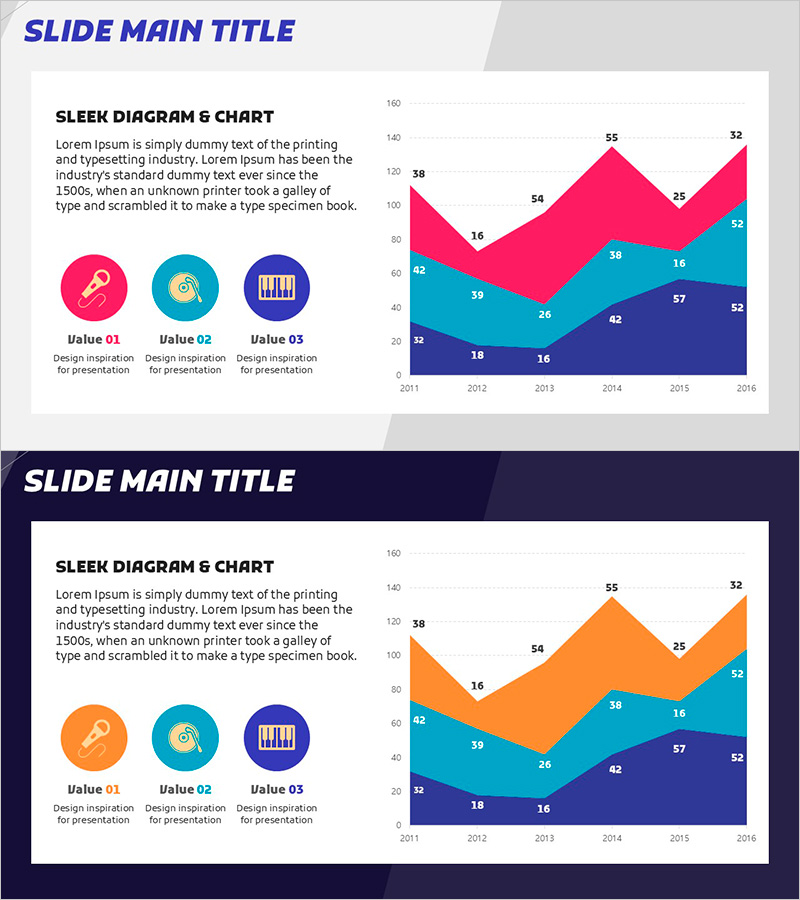
A PowerPoint slide featuring a stacked area chart displaying six years of data trends from 2011 to 2016. The multi-layered visualization uses magenta, cyan, and navy blue to represent three data series, making it ideal for competitive analysis, product revenue trends, and segment performance comparisons. The left side contains a title, descriptive text, and three icon-based legend items, while the right side showcases a large-scale chart that reveals data progression at a glance. Two design variations are included—one with a light gray background and another with a dark navy background—allowing you to match your presentation's overall tone. Each layer's value is clearly labeled with data points, enabling viewers to track both total growth and individual series contributions over time.
Usage Points
-
Main Usage
Displays multiple data series over time using a stacked area format, simultaneously showing total volume changes and individual layer proportions. Ideal for market competitive analysis, product or segment revenue trends, customer segment growth comparisons, and any scenario requiring multi-layered time-series data visualization.
-
How to Use
Enter your analysis title and key insights in the left text area, then label the three legend icons below with your data series names (e.g., Product A, Product B, Product C). Replace the chart values and colors with your actual data, and select either the gray or navy background to match your presentation's design scheme. The slide is immediately ready for use.
-
Recommended For
Recommended for executives, analysts, marketers, and finance professionals presenting investor relations pitches, business performance reports, market analysis and competitive benchmarking, marketing strategy meetings, and financial analysis reports. Particularly effective when communicating multi-layered data trends to senior management and stakeholders.
-
Slide Structure
The slide uses a two-column layout: left 40% for text content (title, description, and three icon-based legend items) and right 60% for the chart area. The chart features a Y-axis scale (0–160), X-axis years (2011–2016), and three color-coded stacked layers. Both slides maintain identical structure with only background color variation.
Related Products
-

World Travel Template Area Chart
#Market and Competitor Analysis #Graph #Other
-

People Icon Infographic Chart – Market and Competitive Analysis
#Market and Competitor Analysis #Graph #Other
-

Study Area Chart - Market Status and Competitive Advantage
#Market and Competitor Analysis #Graph #Other
-

Bar Chart Visualizing Yacht Tour Satisfaction
#Market and Competitor Analysis #Graph #Other
