Visualized In-Body Charts with Horizontal and Vertical Bar Graphs
RJ0600066_18
- Last Update 07/07/2025
- File Size 9MB
- # of Slides 2
- File Format PPTX
- Slide Ratio 16:9
- Color
Keywords
About the Product
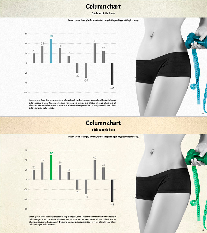
A PowerPoint slide featuring a vertical bar graph that visualizes in-body measurement results with dual-color data comparison. The chart displays approximately 10 data points across two series, using gray and accent colors (teal or green) to distinguish between categories. Positive and negative values are both represented, making it ideal for health and fitness presentations. The right side includes an in-body measurement image for context. Available in 16:9 widescreen PPTX format, fully editable across all PowerPoint versions, with 2 slides included.
Usage Points
-
Main Usage
This slide is designed to visually compare and analyze in-body measurement data or body composition changes. It effectively displays both positive and negative values to communicate improvement or decline trends. Ideal for health screenings, fitness program results, body composition analysis, and wellness-related presentations in medical and healthcare settings.
-
How to Use
Simply input your actual in-body measurement values into the slide, and the data visualization is instantly complete. Adjust bar heights and colors freely to represent multiple items and comparisons. The in-body image on the right can be removed or replaced with alternative imagery. Background colors and text are fully editable to match your presentation theme.
-
Recommended For
Healthcare professionals, nutritionists, fitness trainers, and wellness company representatives explaining body data to patients or clients. Suitable for health screening result presentations, diet program progress reports, fitness center marketing materials, and corporate wellness initiatives.
-
Slide Structure
Both slides feature identical layouts with title and subtitle areas at the top, a vertical bar graph in the center (approximately 10 data points across 2 series), and an in-body measurement image on the right. The graph is centered on zero to represent both positive and negative values, with accent colors highlighting specific data points.
Related Products
-

Camera Comparison Competitive Analysis Slide - Data-Driven Strategy
#Market and Competitor Analysis #Graph #Competitor Analysis
-

Check Pattern Template for Subject Performance Visualization
#Company Introduction #Product/Service Introduction #Graph
-

Travel Market Future Outlook Analysis Chart – Drawing Future Opportunities
#Technical Approach #Market and Competitor Analysis #Graph
-

Data Analysis with Zombie Hand Graph Visualization
#Market and Competitor Analysis #Graph #Competitor Analysis
