Bar Graph Visualizing Elderly Population Ratio
RJ0600001_6
- Last Update 06/21/2025
- File Size 0.2MB
- # of Slides 2
- File Format PPTX
- Slide Ratio 16:9
- Color
Keywords
- #Content-Based Slides
- #Design-Based Slides
- #Market and Competitor Analysis
- #Graph
- #Other
- #Customer Analysis
- #Future Outlook
- #Column
- #Column Chart
- #Silhouette
- #16:9
- #vertical bar chart PowerPoint
- #population ratio slide template
- #demographic data visualization
- #human silhouette icon chart
- #customer analysis PowerPoint
- #market analysis slide template
About the Product
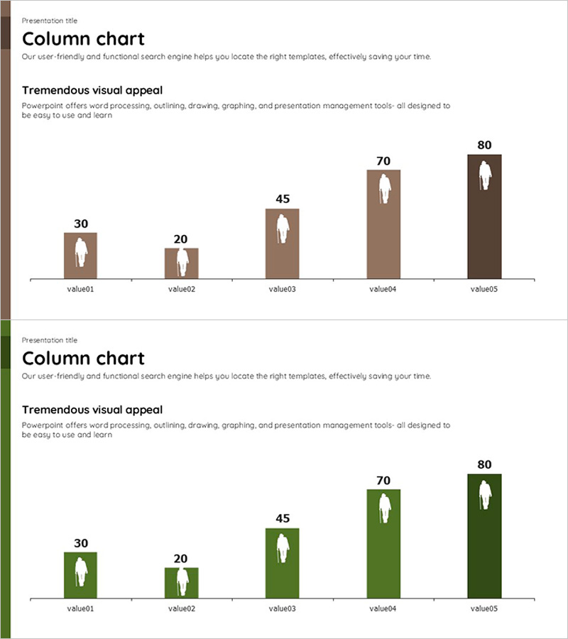
A PowerPoint slide featuring a 5-step vertical bar chart designed to visualize elderly population ratios and demographic data. The slide is available in two color schemes—brown and green—with human silhouette icons embedded within each bar to convey population statistics intuitively. Delivered as a 2-slide PPTX deck in 16:9 aspect ratio, this presentation template is ready for immediate use in market analysis, customer segmentation, and statistical reports. The silhouette-based design makes data-driven insights accessible to diverse audiences.
Usage Points
-
Main Usage
This slide presents five-step numerical data—such as elderly population ratios, customer distribution, or market segmentation—in a comparative bar chart format. The human silhouette icons reinforce the demographic context, while the dual color schemes (brown and green) allow you to match your presentation's visual tone and messaging strategy.
-
How to Use
Insert this slide into market analysis, customer research, or statistical reporting presentations. Replace the sample data with your own figures by editing the bar heights and values. Select the color scheme that aligns with your brand or document theme. Place it in the analysis or findings section of reports, business plans, or investor presentations to enhance data comprehension.
-
Recommended For
Marketing professionals, market research analysts, demographic researchers, policy planners, financial analysts, and data scientists. Ideal for presentations involving customer segmentation, population analysis, market size comparison, age-group statistics, and evidence-based decision-making in business and public sectors.
-
Slide Structure
The 2-slide deck features a 5-step vertical bar chart as the focal element. One slide displays the brown color variant, the other the green variant, providing flexible design options. Each bar incorporates a human silhouette icon to emphasize population-related metrics. The 16:9 widescreen layout ensures compatibility with modern presentation environments and large-screen displays.
Related Products
-

Human Details Infographic Chart – Customer Analysis and Market Overview
#Market and Competitor Analysis #Graph #Other
-

Customer Analysis Forecast Graph – Market Trend Analysis
#Market and Competitor Analysis #Graph #Customer Analysis
-

Exercise Ability Improvement Graph
#Business Strategy #Market and Competitor Analysis #Graph
-

Graphs that draw a successful future outlook – Visualizing Market Trends
#Market and Competitor Analysis #Graph #Other
