Before and After 3D Comparison Graph – Market and Performance Analysis
RJ0500018_15
- Last Update 06/11/2025
- File Size 0.5MB
- # of Slides 2
- File Format PPTX
- Slide Ratio 16:9
- Color
Keywords
- #Content-Based Slides
- #Design-Based Slides
- #Market and Competitor Analysis
- #Financial Plans and Performance
- #Graph
- #Future Outlook
- #Sales and Revenue
- #Column
- #Column Chart
- #16:9
- #vertical column chart PowerPoint
- #before and after comparison slide
- #market analysis graph
- #financial performance chart
- #data comparison presentation
- #bar chart template download
About the Product
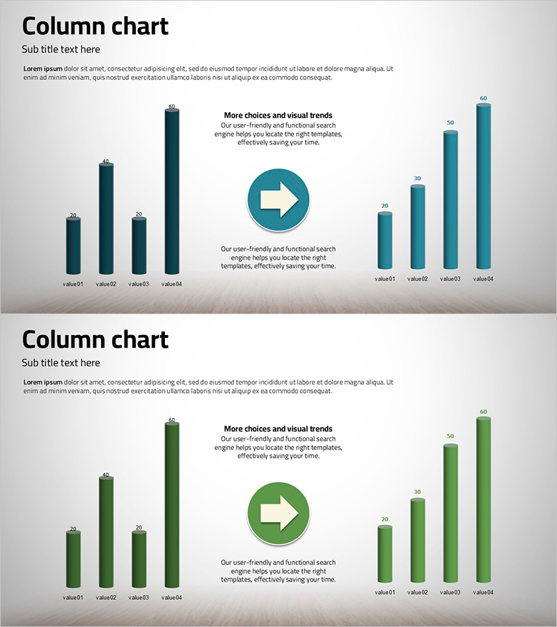
A vertical column chart PowerPoint slide that visualizes market performance and financial results side by side. The slide features eight data points divided into two series: dark blue columns on the left and light blue columns on the right, with a white arrow icon in the center emphasizing the direction of change. Each column is scaled from 0 to 60, making quantitative comparison straightforward and suitable for immediate use in presentations, reports, and analytical materials. The 2-slide set includes color variations (dark blue and green palettes) and is optimized for 16:9 widescreen format, compatible with modern projectors and online presentations.
Usage Points
-
Main Usage
Effectively communicate quantitative data in executive reports, business performance analyses, and market research presentations using a clear left-right comparison structure. Ideal for year-over-year growth rates, competitive benchmarking, departmental performance metrics, and any scenario requiring simultaneous visualization of two time series or categories.
-
How to Use
Double-click each column to input numerical values; the chart updates automatically. Modify legend and axis labels by clicking them directly. Adjust colors through the shape formatting menu and select from available palettes. Edit the title and subtitle text boxes to match your presentation context and customize the layout as needed.
-
Recommended For
Finance teams presenting quarterly and annual results, marketing teams analyzing campaign performance, sales teams comparing regional or product-based metrics, and executive leadership preparing strategic decision-making materials. Particularly valuable for data-driven organizations requiring high-credibility visualizations.
-
Slide Structure
Slide 1: Dark blue vertical column chart (4 items on left vs. 4 items on right, 0–60 scale). Slide 2: Green palette with identical structure. Each slide includes title and subtitle areas, a centered white arrow icon, and explanatory text boxes for context and annotations.
Related Products
-

Polygonal Template Vertical Bar Graph – Market Analysis and Financial Planning
#Market and Competitor Analysis #Financial Plans and Performance #Graph
-

Line Graph Visualizing Future Market Outlook for Sailing Travel
#Market and Competitor Analysis #Financial Plans and Performance #Graph
-

Technology Service Future Outlook and Expected Effect – High-Quality Graph Design
#Business Strategy #Market and Competitor Analysis #Graph
-

Typographic Wide Template Bar Chart & Table – Competitive Analysis and Performance
#Market and Competitor Analysis #Financial Plans and Performance #Diagram
