Diet Preference Graph – A Tool for Market Analysis
RJ0600066_14
- Last Update 07/07/2025
- File Size 9.2MB
- # of Slides 2
- File Format PPTX
- Slide Ratio 16:9
- Color
Keywords
- #Content-Based Slides
- #Design-Based Slides
- #Market and Competitor Analysis
- #Graph
- #Market Analysis
- #Horizontal Bar
- #Horizontal Bar Chart
- #16:9
- #horizontal bar chart PowerPoint
- #diet preference slide template
- #market analysis presentation
- #data comparison chart
- #bar graph template download
- #PowerPoint data visualization slide
About the Product
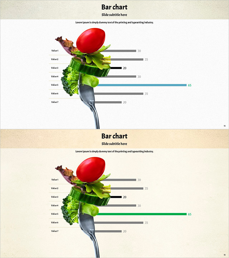
A horizontal bar chart PowerPoint slide designed for diet preference and market analysis presentations. This slide features seven items displayed as horizontal bars in gray, blue, and black tones, enabling clear numerical comparison across categories. Fresh vegetable and tomato imagery at the top makes it immediately suitable for food, nutrition, and health-related presentations. The 2-slide set offers different background colors (white and beige) to match various document styles, with fully editable data fields for quick customization.
Usage Points
-
Main Usage
Visualize consumer preference surveys and market analysis results for food, nutrition, and health sectors. The 7-item horizontal layout allows intuitive comparison of relative values across categories, enhancing data credibility in marketing, sales, and strategic planning presentations.
-
How to Use
Replace Value1–Value7 labels and numbers (30, 35, 20, 30, 65, 35, 20) with your actual data. Bar lengths and colors adjust automatically. Customize the title and subtitle text to match your presentation topic. Both slides share the same structure; choose the background color that best fits your document style.
-
Recommended For
Food and beverage company market research presentations, nutritionist and diet specialist consumer analysis reports, marketing team product preference survey results, school and research institution food consumption statistics presentations.
-
Slide Structure
Each slide contains a title area (top), subtitle text, food imagery on the left (tomato, vegetables, utensil), and a horizontal bar chart on the right. The chart consists of 7 rows (Value1–7) with horizontal bars; select bars are highlighted in accent colors (blue, green) to emphasize peak values visually.
Related Products
-

User Gender Ratio Analysis – Market Insights
#Market and Competitor Analysis #Graph #Customer Analysis
-

Space Industry Analysis Graph Chart – Market and Competitive Analysis
#Market and Competitor Analysis #Graph #Customer Analysis
-

Bar Chart for Class Evaluation Results – Visual Appeal and Eye-Catching
#Market and Competitor Analysis #Graph #Market Status
-

Premium Coffee Customer Demographics and Popular Menu – Comprehensive Customer Analysis
#Market and Competitor Analysis #Customer Success Stories #Graph
