Building Trends Line Chart – Visual Tool for Performance Analysis
RJ0900009_15
- Last Update 08/18/2025
- File Size 0.1MB
- # of Slides 2
- File Format PPTX
- Slide Ratio 16:9
- Color
Keywords
- #Content-Based Slides
- #Design-Based Slides
- #Business Strategy
- #Market and Competitor Analysis
- #Graph
- #Achievements
- #Market Status
- #Line
- #Line Chart
- #16:9
- #line chart PowerPoint slide
- #multi-series trend analysis
- #3-series line graph template
- #how to create line chart in PowerPoint
- #performance data visualization slide
About the Product
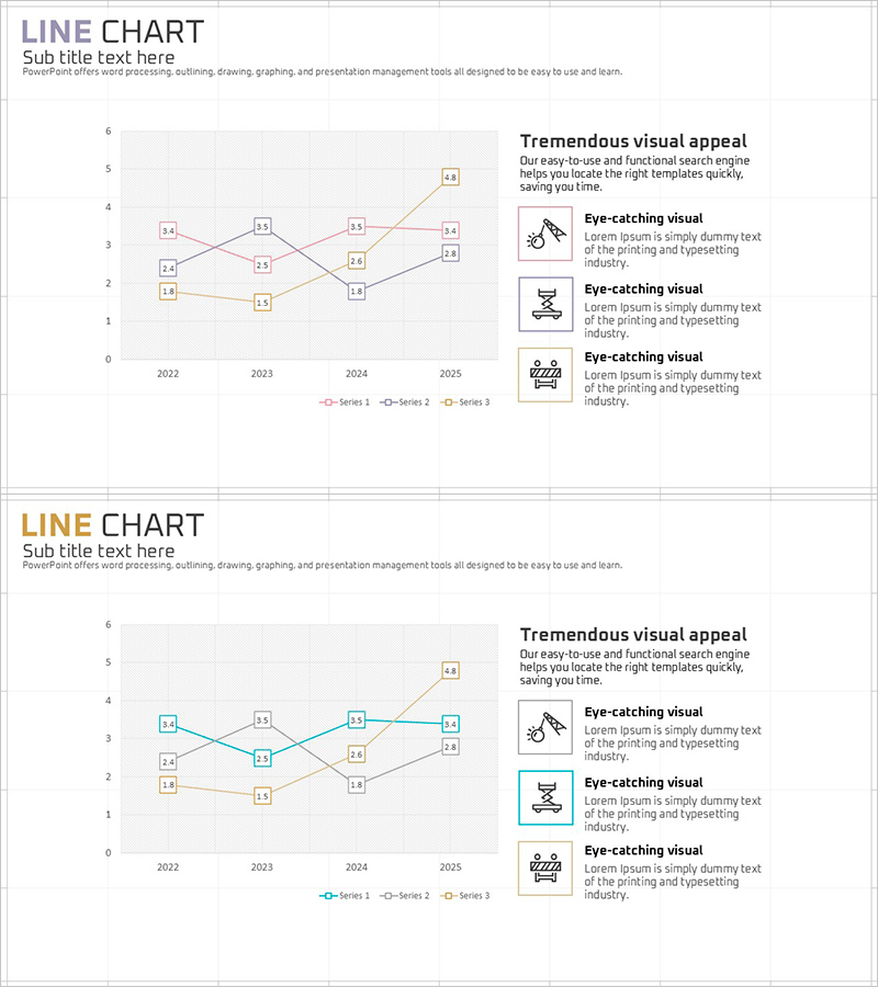
A multi-series line chart PowerPoint slide comparing data trends across four years (2022–2025) with three distinct data series. Each data point displays numerical labels for precise performance analysis, while the gray background and contrasting pink, blue, and orange color palette enhance visual clarity. The right side features three icon placeholders with accompanying text areas for highlighting key insights. This presentation slide is ready to use for performance reports, quarterly earnings presentations, market trend analysis, and strategic reviews across construction, real estate, marketing, finance, and other industries.
Usage Points
-
Main Usage
Visualizes year-over-year, quarterly, or monthly performance data to identify trends and changes over time. Enables simultaneous comparison of multiple departments, products, or regions, making it ideal for executive reports, investor presentations, and marketing performance reviews.
-
How to Use
Input your actual data into the left chart area, and the trend lines automatically update across all three series. Add key findings, improvements, and strategic recommendations in the right-side text boxes. Replace icons to reflect your industry or department, and adjust the color scheme to match your corporate branding.
-
Recommended For
Finance, executive management, marketing, sales, construction, real estate, and IT professionals requiring data-driven performance reporting. Suitable for quarterly earnings presentations, annual business reports, investor briefings, market analysis documents, and departmental performance evaluations.
-
Slide Structure
Left side displays a line chart with X-axis (years 2022–2025) and Y-axis (0–6 scale) showing three color-coded data series. Each data point includes numerical labels for precise value reference. Right side contains three stacked icon placeholders with accompanying text input areas for key insights and commentary.
Related Products
-

Market Analysis Broken Line Graph – Visualizing Business Performance
#Business Strategy #Market and Competitor Analysis #Graph
-

Infographic Slide Visualizing App Market Sales Trends
#Business Strategy #Market and Competitor Analysis #Graph
-

Market Status Chart Analysis – Data-Driven Insights
#Business Strategy #Market and Competitor Analysis #Graph
-

Sewing Graph Chart – Market Status and Performance Analysis
#Business Strategy #Market and Competitor Analysis #Diagram
