Demand According to Coffee Containers – Multi-Directional Diagram
RJ0600057_12
- Last Update 07/05/2025
- File Size 4.8MB
- # of Slides 2
- File Format PPTX
- Slide Ratio 16:9
- Color
Keywords
- #Content-Based Slides
- #Design-Based Slides
- #Business Strategy
- #Marketing Plan and Strategy
- #Financial Plans and Performance
- #Diagram
- #Achievements
- #Sales and Revenue
- #Flow
- #Multidirectional Flow
- #16:9
- #multi-directional diagram PowerPoint
- #coffee marketing presentation
- #demand comparison slide
- #arrow diagram PPT
- #product comparison template
- #PowerPoint diagram slide design
About the Product
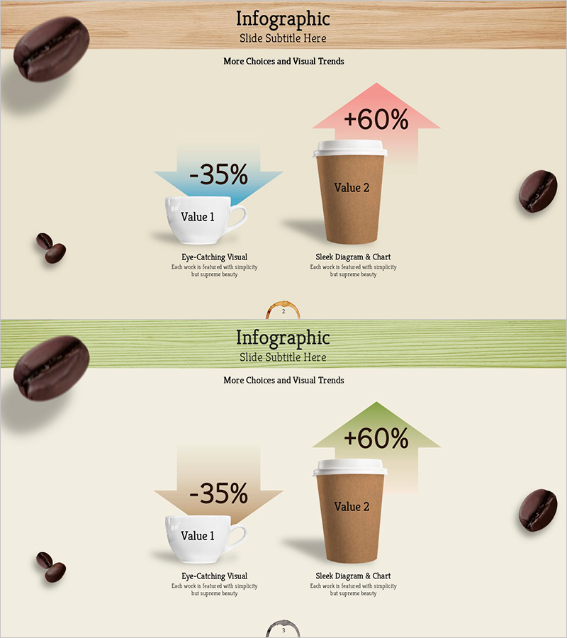
A multi-directional diagram PowerPoint slide that visualizes demand trends across different coffee container types. The design uses a blue arrow to represent declining demand (-35%) and a pink arrow to show increasing demand (+60%), with a central coffee cup mockup for intuitive product comparison. The 2-slide set includes two header style variations: a wood-tone header and a green-line header, allowing flexible application across different presentation sections. Ideal for marketing plans, business strategy presentations, and product positioning decks that require clear visual comparison of market demand shifts.
Usage Points
-
Main Usage
Designed to compare and analyze demand variations across products or services using multi-directional arrows. Perfect for marketing presentations where you need to communicate customer preference changes, market demand trends, and product positioning strategies. The contrasting blue (decline) and pink (growth) arrows enable simultaneous visualization of positive and negative data points.
-
How to Use
Replace the slide text labels and numerical values with your own data for immediate use. Arrow colors and directions can be adjusted to match your growth or decline metrics, and the central product mockup image can be swapped to apply the template to various product comparisons. Choose between the wood-tone header or green-line header version based on your presentation theme.
-
Recommended For
Marketing managers, business planning teams, product managers, and sales strategy professionals presenting customer demand analysis, product positioning, and market comparisons. Applicable beyond the coffee industry to consumer goods, packaging strategy, channel-based sales comparison, and other business contexts requiring multi-factor demand visualization.
-
Slide Structure
Two-slide set with each slide featuring a central product mockup (coffee cup) flanked by a blue arrow on the left (-35%, Value 1) and a pink arrow on the right (+60%, Value 2) in symmetrical arrangement. Header sections vary between wood-tone background and green-line styling, with descriptive text areas at the bottom. Optimized for 16:9 widescreen format for modern presentation environments.
Related Products
-

Promotion Strategy Diagram – Visualizing Marketing Strategies
#Marketing Plan and Strategy #Diagram #Promotion Strategy
-

Visualization of Major Sales Growth Segments – Performance and Strategy
#Business Strategy #Financial Plans and Performance #Graph
-

Vertical General Bar Chart – Clear Performance Analysis
#Business Strategy #Financial Plans and Performance #Graph
-

Blue Column Chart – Visualizing Sales Performance
#Business Strategy #Financial Plans and Performance #Graph
