Blue Column Chart – Visualizing Sales Performance
RB0800001_8
- Last Update 03/17/2025
- File Size 0.5MB
- # of Slides 2
- File Format PPTX
- Slide Ratio 4:3
- Color
Keywords
About the Product
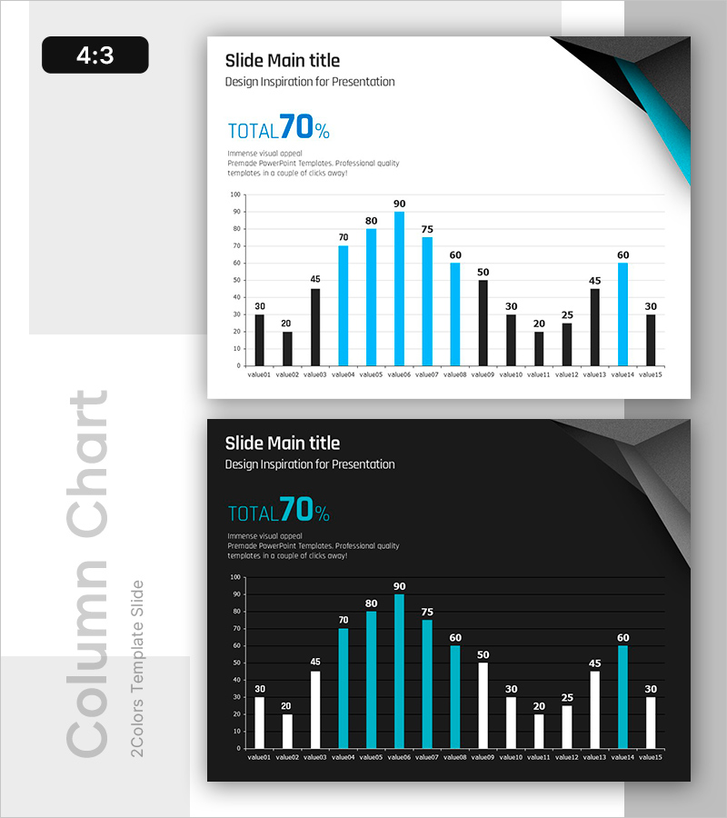
A vertical bar chart PowerPoint slide featuring a two-tone black and blue color scheme for data visualization. The slide displays 15 data points with values ranging up to 90, using contrasting black and blue bars to differentiate between two data series. Provided in 4:3 aspect ratio with 2 slide layouts: one with a light background and one with a dark background for flexible presentation environments. Ideal for immediate use in business performance reports, quarterly reviews, and financial presentations.
Usage Points
-
Main Usage
Visualize and compare multiple data points such as sales performance, departmental results, quarterly growth rates, and product sales volumes. The contrasting black and blue bars enable clear differentiation between two data series, making numerical comparisons intuitive and impactful.
-
How to Use
Use in business strategy presentations, quarterly performance reports, financial planning sessions, and marketing analytics reviews. The light background version suits standard conference rooms, while the dark background version is optimized for large-screen presentations and digital displays.
-
Recommended For
Finance teams, sales departments, marketing professionals, and executives requiring quantitative data analysis. Suitable for quarterly performance reviews, annual evaluations, ROI analysis, and strategic business decision-making presentations.
-
Slide Structure
Two-slide layout featuring identical chart designs on contrasting backgrounds—one light (white) and one dark (black). Each slide includes a title area, 'TOTAL 70%' emphasis text, and a 15-item vertical bar chart with black and blue columns. Y-axis ranges from 0 to 100 with labeled data points (value01 through value15).
Related Products
-

Vertical General Bar Chart – Clear Performance Analysis
#Business Strategy #Financial Plans and Performance #Graph
-

Square Frame Template Column Chart – Business Performance Report
#Business Strategy #Financial Plans and Performance #Graph
-

Breaking Sales Records – Visualizing Performance
#Business Strategy #Financial Plans and Performance #Graph
-

Analysis of Factors Contributing to Excellent Sales Performance – Visualizing Success
#Business Strategy #Financial Plans and Performance #Graph
