Color Bell Chart for Data Visualization – Embracing Positive Change
RJ0600047_18
- Last Update 07/03/2025
- File Size 1.1MB
- # of Slides 2
- File Format PPTX
- Slide Ratio 16:9
- Color
Keywords
About the Product
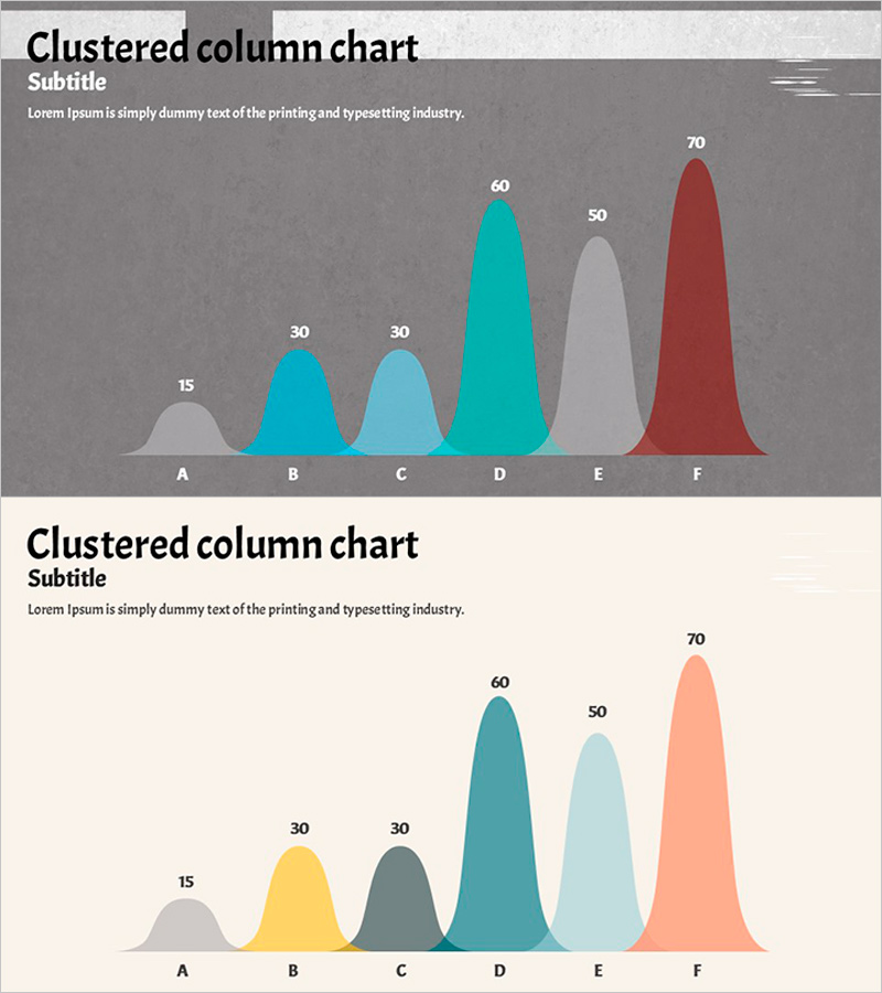
A PowerPoint slide featuring a bell curve distribution chart to visualize data spread and comparative trends across six data points. Each category (A through F) is represented in distinct colors—gray, teal, light teal, coral, and red—making numerical differences immediately apparent. The 2-slide template includes both dark gray and light beige background versions, allowing you to select the design that best matches your presentation environment and document style. Ideal for reports, analytical presentations, and marketing decks where quantitative data needs clear visual communication.
Usage Points
-
Main Usage
Visualize quantitative data distribution and comparisons using a bell curve chart to clearly communicate numerical information in reports, analytical presentations, and marketing materials. Enables stakeholders to instantly grasp relative magnitudes and rankings for informed decision-making.
-
How to Use
Replace the sample data points (A–F with values 15, 30, 30, 60, 50, 70) with your own metrics. Color coding automatically distinguishes each category. Use the dark background version for projector presentations and the light background version for printing or PDF distribution.
-
Recommended For
Financial analysts, marketing managers, data science teams, and executives presenting quarterly results, customer satisfaction scores, market share, or sales performance. Also suitable for academic presentations, consulting proposals, and performance reports requiring quantitative data visualization.
-
Slide Structure
Two-slide template with identical chart layouts on dark gray (top) and beige (bottom) backgrounds. Each slide displays six bell curve shapes (A–F) with numerical labels (15, 30, 30, 60, 50, 70) in a color-coded palette: gray, teal, light teal, deep teal, light gray, and coral red.
Related Products
-

Global Customer Market Analysis Slide – Market and Competitor Analysis
#Market and Competitor Analysis #Graph #Other
-

Striking Performance Gap in Agricultural Outcomes
#Business Strategy #Financial Plans and Performance #Graph
-

Radial Graph of Data Analysis by Year – Market and Competitive Analysis
#Market and Competitor Analysis #Graph #Market Analysis
-

Technology Status Radial Graph – Modern Design
#Business Introduction #Graph #Technological Status
