Future Outlook Line Graph – Blue and Gray Design
RJ0600029_17
- Last Update 06/28/2025
- File Size 0.4MB
- # of Slides 2
- File Format PPTX
- Slide Ratio 16:9
- Color
Keywords
About the Product
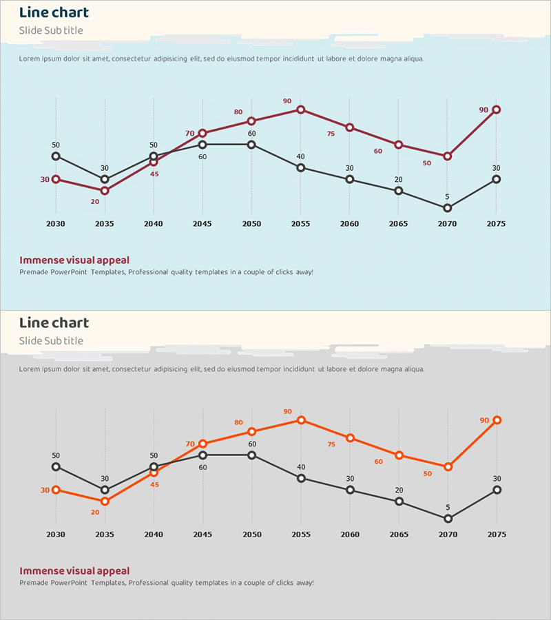
A multi-series line chart PowerPoint slide visualizing long-term data trends from 2030 to 2075. Three distinct series in red, black, and gray represent different metrics, with 10 data points clearly labeled with numerical values for precise information delivery. The light blue background and gray gridlines enhance data readability, while the 2-slide set allows the same dataset to be presented with different emphasis approaches. Ideal for future outlook presentations, market analysis, performance tracking, and strategic forecasting in business reports and investor pitches.
Usage Points
-
Main Usage
Effectively compares and analyzes long-term data trends across multiple metrics. The three-series format enables simultaneous comparison of related indicators, while numerical labels on each data point ensure precise information delivery. Perfect for future outlook presentations, market predictions, performance reports, and strategic planning discussions.
-
How to Use
The 2-slide set presents the same data with different emphasis strategies. Use the first slide to show all three series for comprehensive comparison, and the second slide to highlight a specific series for focused messaging. Simply replace the numerical values with your own data for immediate use in presentations.
-
Recommended For
Ideal for executives, planning teams, analysts, and marketing professionals presenting business strategies, market analysis, and performance reports. Particularly effective for investor presentations, board meetings, and strategic planning sessions where long-term trends are critical. Suitable for comparing financial metrics, sales performance, customer satisfaction, and other KPIs.
-
Slide Structure
X-axis spans 2030-2075 in 10-year intervals; Y-axis ranges from 0-100. Three series (red, black, gray) each connect 10 data points across the timeline. Light blue background with vertical gridlines marks each decade clearly. Numerical labels appear at every data point. Both slides share identical structure but emphasize different series.
Related Products
-

Competitor Analysis Broken Line Graph
#Market and Competitor Analysis #Graph #Competitor Analysis
-

Space Exploration Pie Chart – A New Horizon for Data Analysis
#Product/Service Introduction #Graph #Development Status
-

Weather Bar Graph - Market Status Analysis
#Market and Competitor Analysis #Graph #Market Status
-

Graphs of Learning and Growth – Visual Data Presentation
#Market and Competitor Analysis #Diagram #Graph
