Competitor Analysis Broken Line Graph
RJ0300019_11
- Last Update 04/22/2025
- File Size 11MB
- # of Slides 2
- File Format PPTX
- Slide Ratio 16:9
- Color
Keywords
About the Product
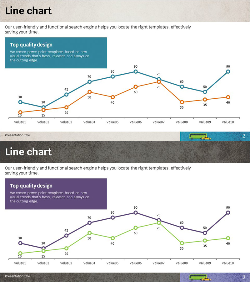
A dual-series line chart PowerPoint slide designed to visualize competitor performance and market trends over time. The slide features two data series in teal and orange, tracking 10 data points to clearly show performance changes and competitive positioning. Each slide includes a 'Top Quality Design' information box at the top to reinforce presentation context, optimized for 16:9 widescreen format. Fully editable PPTX format allows you to input your own data, adjust colors, and customize labels to match your competitive analysis narrative.
Usage Points
-
Main Usage
Compare competitor performance metrics and market trends across time periods. The dual-line design simultaneously displays key indicators such as growth rates, market share, customer satisfaction, or revenue trends, making competitive advantages immediately visible to your audience.
-
How to Use
Insert this slide into marketing strategy presentations, business reports, investor pitch decks, and competitive analysis sections. Replace data points with your actual competitor metrics, update series labels, and adjust colors as needed. You can easily add additional data series or modify the chart range to fit your specific analysis.
-
Recommended For
Marketing managers, strategic planning teams, business development professionals, and executives presenting competitive analysis. Ideal for market entry strategies, product positioning discussions, performance reviews, and investor relations presentations where trend comparison is critical.
-
Slide Structure
Two-slide set with consistent layout: information box at top (title and descriptive text) and line chart below. Chart features 10 X-axis data points (value01–value10), Y-axis scale (0–90), two colored lines (teal and orange) representing data series, and numeric labels at each data point for clarity.
Related Products
-

Competitor Progress Comparison Analysis Graph – Essential Tool for Market Analysis
#Market and Competitor Analysis #Graph #Competitor Analysis
-

Car Wide Template Line Chart 2 – Market Analysis and Competitor Comparison
#Market and Competitor Analysis #Diagram #Graph
-

Visualizing Menu Sales Status with Line Chart
#Market and Competitor Analysis #Graph #Competitor Analysis
-

Comparative Analysis Graph by Year – Data Visualization
#Product/Service Introduction #Market and Competitor Analysis #Graph
