Space Exploration Pie Chart – A New Horizon for Data Analysis
RJ0400022_15
- Last Update 05/23/2025
- File Size 0.6MB
- # of Slides 2
- File Format PPTX
- Slide Ratio 16:9
- Color
Keywords
About the Product
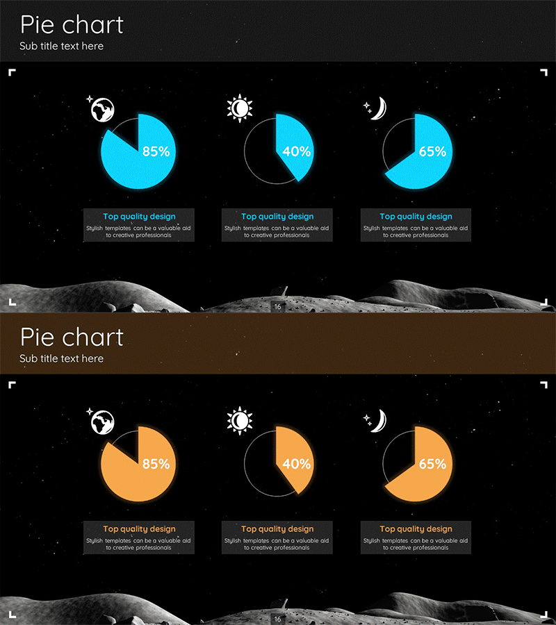
A space exploration-themed pie chart PowerPoint slide featuring two color variations with cyan blue and orange accents on a dark background. Each slide displays three pie charts arranged horizontally, with globe, sun, and moon icons representing time-based or categorical data segments. Percentage values (85%, 40%, 65%) are clearly labeled, and descriptive text areas below each chart enable immediate customization for statistical presentations. Provided in 16:9 widescreen PPTX format with fully editable elements for data analysis and reporting.
Usage Points
-
Main Usage
Visualizes proportion and composition data using circular pie charts. Effectively communicates market share, budget allocation, customer distribution, sales breakdown, and part-to-whole relationships. Space exploration icons differentiate data by time period, region, or category for enhanced clarity and engagement.
-
How to Use
Edit the percentage values and colored segments to match your dataset, then customize the descriptive text boxes below each chart with data sources, interpretations, and conclusions. Insert into presentation sections requiring ratio comparisons—such as market analysis, financial overview, customer segmentation, or performance metrics—to enhance audience comprehension.
-
Recommended For
Ideal for marketing, sales, finance, and analytics professionals presenting data-driven insights. Suitable for business plans, quarterly reports, investor presentations, market research findings, financial analysis reports, customer segmentation strategies, and competitive analysis slides.
-
Slide Structure
2-slide layout with 3 pie charts per slide arranged horizontally. Each chart displays percentages (85%, 40%, 65%) with globe, sun, and moon icons above. Title area at top, descriptive text boxes below each chart. Two color options: cyan blue version and orange version for design flexibility.
Related Products
-

Triangle Pattern Template with Hexagon Pie Chart
#Product/Service Introduction #Business Management #Diagram
-

Watch Shape Market Share Graph – Data Visualization and Analysis
#Product/Service Introduction #Market and Competitor Analysis #Diagram
-

Medical Business Profit Structure Analysis Pie Chart
#Product/Service Introduction #Business Introduction #Diagram
-

Clock Image Shape Diagram – Product Status Presentation
#Product/Service Introduction #Diagram #Graph
