Eco-friendly Donut Chart – A New Perspective on Market Analysis
RJ0600029_10
- Last Update 06/28/2025
- File Size 0.4MB
- # of Slides 2
- File Format PPTX
- Slide Ratio 16:9
- Color
Keywords
About the Product
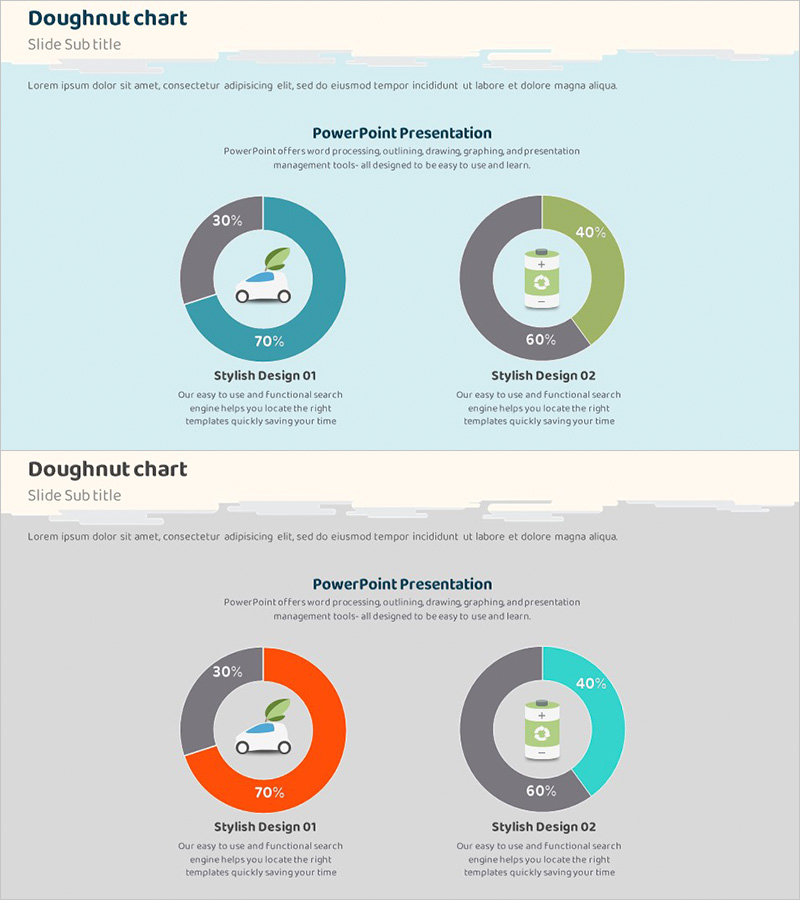
A professional donut chart PowerPoint slide set designed for market analysis and data comparison presentations. The slides feature a harmonious color palette of teal, gray, and lime green, with two donut graphs positioned side-by-side on each slide to visualize and compare two different metrics simultaneously. Each chart includes a central icon area for category imagery and clear percentage labels with legend information. The 16:9 widescreen format contains 2 fully editable slides suitable for financial reports, marketing analysis, business performance presentations, and data-driven storytelling. The intuitive layout allows quick customization of data values, labels, and colors to match your brand identity.
Usage Points
-
Main Usage
Designed to compare and analyze two data metrics side-by-side with clear visual hierarchy. The central icon area allows you to add category symbols or labels, while percentage values are prominently displayed for accurate data communication. Ideal for presenting market share, sales composition, budget allocation, customer satisfaction metrics, and other ratio-based information.
-
How to Use
Open the slide and replace the sample data with your own values in each donut graph. Update the legend text and category labels to match your presentation context. Insert relevant icons or images in the central areas to represent each category. Colors can be easily adjusted to align with your corporate branding or presentation theme.
-
Recommended For
Finance teams presenting budget allocation reports, marketing teams analyzing market trends, sales teams showcasing performance metrics, executive presentations on business status, consulting proposals with data sections, and academic presentations requiring statistical visualization. Particularly effective when comparing two related indicators or metrics.
-
Slide Structure
2-slide set with each slide containing 2 donut charts arranged horizontally. Each donut graph is divided into 2-3 data series with a central icon insertion area and legend space below. Slide 1 features teal-gray-lime green color scheme; Slide 2 offers orange-gray-teal variation for visual diversity and flexible design options.
Related Products
-

Analysis of Crime Occurrence Locations – Data Visualization
#Market and Competitor Analysis #Graph #Market Share
-

Analyzing Market Share with 3 Donut Charts and Tables
#Market and Competitor Analysis #Diagram #Graph
-

Donut Chart Visualizing Merchandise Sales Proportion
#Market and Competitor Analysis #Graph #Market Share
-

Visualizing Competitive Analysis with Table and 3 Donut Graphs
#Market and Competitor Analysis #Diagram #Graph
