Bundled Horizontal Bar Graph – Data Comparison and Visual Appeal
RJ0600017_31
- Last Update 06/25/2025
- File Size 0.1MB
- # of Slides 2
- File Format PPTX
- Slide Ratio 16:9
- Color
Keywords
About the Product
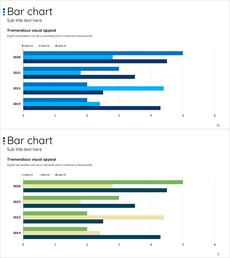
A grouped horizontal bar chart PowerPoint slide optimized for multi-year performance comparison and multi-series data visualization. The 2-slide set features the first slide with blue-toned 3-series data arranged by year (2019–2028), and the second slide presents the same data in a mixed color palette of green, blue, and beige. Each bar is aligned against a 0–6 numerical axis, enabling intuitive size comparison across items. Perfect for business presentations, annual reports, and performance analysis to clearly communicate year-over-year trends, departmental achievements, regional sales volumes, and other multi-item changes over time. The slides are ready to use as presentation templates with fully editable colors and numerical values.
Usage Points
-
Main Usage
Visualize year-over-year performance, departmental or regional sales comparisons, quarterly achievement analysis, and other multi-item numerical data simultaneously. Bar length provides intuitive numerical comparison, making it effective for executive briefings, investor presentations, and business analysis reports.
-
How to Use
Replace the displayed values and legend labels (value 01, 02, 03) with your own data. Input year or item names on the Y-axis and reflect each series' values in the X-axis bar length. Colors can be customized to match brand guidelines. Both slides share the same structure, allowing flexible color combination variations.
-
Recommended For
Financial and executive reports, quarterly and annual performance analysis, marketing results presentations, market analysis sections in business plans, investor pitch decks, consulting reports, and academic presentations. Especially useful when comparing three or more data series.
-
Slide Structure
2-slide set. Slide 1: Blue-toned 3-series (value 03, 02, 01) grouped horizontal bars, 5 years displayed (2019, 2022, 2025, 2028, etc.), 0–6 numerical axis. Slide 2: Identical structure with green, blue, and beige 3-series. Each slide includes title, subtitle area, and legend.
Related Products
-

Farm Target Analysis Marketing Donut Chart
#Market and Competitor Analysis #Graph #Market Share
-

Horizontal Bar Chart Slide for Four-Year Change Figures
#Market and Competitor Analysis #Graph #Industry Trends
-

User Analysis Graph Visualization – Market and Customer Insights
#Market and Competitor Analysis #Graph #Other
-

User Analysis Graph by Age Group – Advanced Data Insights
#Market and Competitor Analysis #Diagram #Graph
