US Target Region Analysis Graph – Visualizing Market Status
RJ0400050_10
- Last Update 05/30/2025
- File Size 0.3MB
- # of Slides 2
- File Format PPTX
- Slide Ratio 16:9
- Color
Keywords
- #Content-Based Slides
- #Design-Based Slides
- #Market and Competitor Analysis
- #Graph
- #Other
- #Market Analysis
- #Target Market
- #Horizontal Bar
- #Segmented Horizontal Bar
- #Map
- #16:9
- #US map PowerPoint slide
- #regional analysis presentation
- #market status visualization
- #horizontal bar chart slide
- #geographic data visualization
About the Product
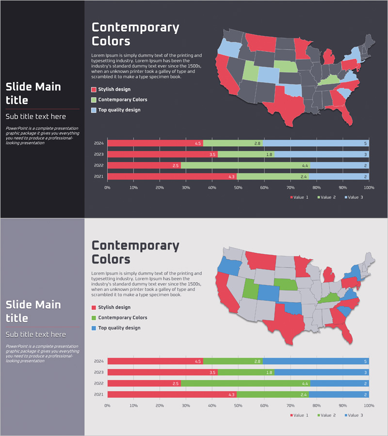
A PowerPoint slide designed for analyzing and presenting market status across the United States at the state level. The slide combines a color-coded US map with a horizontal bar chart showing year-over-year data from 2024 to 2021. Four distinct colors (red, green, blue, gray) represent different market categories or performance tiers, enabling clear regional comparison. The map displays all 50 states with color differentiation, while the accompanying bar chart visualizes three data series across four years. Ideal for investor presentations, market analysis reports, and regional marketing strategy decks where geographic market segmentation and regional performance comparison are essential.
Usage Points
-
Main Usage
Visualize and compare US market data at the state level using a color-coded geographic map paired with multi-year bar chart data. The combination of map and graph enables simultaneous display of regional performance, market share, and category distribution for intuitive market status communication.
-
How to Use
Use in investor presentations, market analysis reports, and regional marketing strategy meetings. Customize map colors to match your data categories, input actual market figures into the bar chart, and update legend labels and year indicators to reflect your specific analysis period and metrics.
-
Recommended For
Marketing managers, sales strategy teams, executives, management consultants, and market analysts. Apply when comparing regional sales, customer distribution, market share, brand awareness, or any geographic performance metrics across US states.
-
Slide Structure
Slide 1: US map with all 50 states color-coded + 4-color legend + descriptive text area. Slide 2: Horizontal bar chart displaying 2024–2021 data with 3 data series + legend. Both map and chart are fully editable shapes allowing easy customization of colors, values, and labels.
Related Products
-

Target Country Analysis Chart – Data Visualization for Market Analysis
#Market and Competitor Analysis #Graph #Other
-

Target Market Analysis Data Table - Market Growth Statistics
#Market and Competitor Analysis #Graph #Other
-

Asia Target Market Analysis Graph – Tremendous Visual Appeal
#Market and Competitor Analysis #Graph #Other
-

Regional Analysis Graphs – Visualizing Market Trends
#Market and Competitor Analysis #Graph #Other
