Pink Navy Distribution Curve Graph – Effective Solutions for Market Analysis
RJ0500028_22
- Last Update 06/14/2025
- File Size 0.2MB
- # of Slides 2
- File Format PPTX
- Slide Ratio 16:9
- Color
Keywords
About the Product
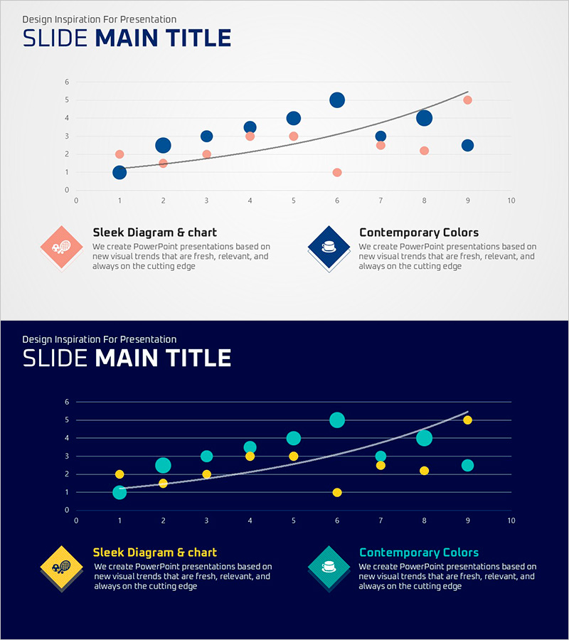
A professional distribution curve graph PowerPoint slide optimized for market analysis and data visualization. This 2-slide set features pink and navy dual-tone colors with both light and dark background versions to suit any presentation environment. The scatter plot combined with trend line layout intuitively displays data distribution patterns and correlations, while legend and icon elements enhance information clarity. Immediately applicable for market overview analysis, competitive benchmarking, and future outlook planning in business presentations and strategic reports.
Usage Points
-
Main Usage
A graph slide designed for market overview analysis and data-driven decision-making. The scatter plot and trend line enable quick understanding of data distribution patterns, correlations, and market trends, applicable to competitive positioning, customer segmentation, and market opportunity analysis.
-
How to Use
Use the light background slide for bright conference rooms and online presentations, and the dark background slide for large auditoriums and projector environments. Clearly distinguish data categories through legends and icons, then add analysis findings and insights to text areas to complete your presentation narrative.
-
Recommended For
Marketing strategists, business analysts, consultants, and investor relations professionals benefit from this slide when visualizing market research results, competitive analysis, and customer insights. Particularly valuable for executive reports, investor pitch decks, and strategic planning meetings requiring data-backed decision support.
-
Slide Structure
Composed of 2 slides, each with 1 title area, 1 graph area, and 2 legend/description areas. Enter your analysis topic in the top title, reflect data in the central graph, and explain the meaning of pink (one group) and navy (another group) in the bottom legend section.
Related Products
-

Weather Impact on Travel Analysis - Market Outlook Graph
#Market and Competitor Analysis #Graph #Other
-

Children's Education Area Graph – Market Trends Analysis
#Market and Competitor Analysis #Graph #Other
-

Curved Hill Shape Graph – Market Trend and Growth Analysis
#Market and Competitor Analysis #Graph #Other
-

Visualizing the Changing Trend of the Ageing Population with a 100% Stacked Bar Graph
#Business Strategy #Market and Competitor Analysis #Marketing Plan and Strategy
