Donut Chart Analysis by Academic Content – Performance-Based Strategy
RJ0500025_28
- Last Update 06/13/2025
- File Size 0.4MB
- # of Slides 2
- File Format PPTX
- Slide Ratio 16:9
- Color
Keywords
- #Content-Based Slides
- #Design-Based Slides
- #Business Strategy
- #Diagram
- #Graph
- #Achievements
- #Cluster
- #Circles
- #Closed Cluster Diagram
- #Doughnut Chart
- #16:9
- #donut chart PowerPoint
- #pie chart slide template
- #4-segment data visualization
- #performance analysis PPT
- #category comparison slide
- #ratio representation PowerPoint
About the Product
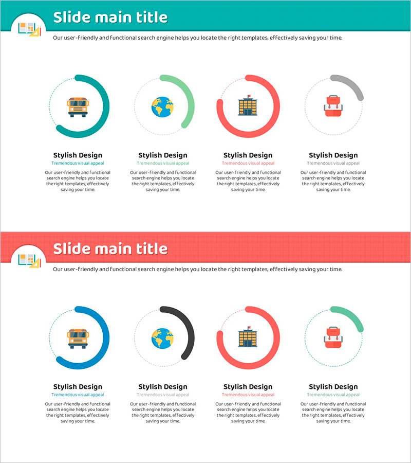
A professional donut chart PowerPoint slide template for visualizing academic content performance across four categories. Features a teal, green, red, and gray color palette with distinct central icons (bus, globe, building, briefcase) representing each data segment. The 2-slide set enables flexible ratio representation suitable for business strategy presentations, technical analysis, and performance-based decision-making reports. Delivered in 16:9 widescreen PPTX format for seamless compatibility across all presentation platforms.
Usage Points
-
Main Usage
Clearly present performance ratios by academic content category, strategic resource allocation across business domains, and technical composition analysis using circular chart visualization. Central icons provide intuitive meaning for each segment while four distinct colors emphasize data differentiation.
-
How to Use
Insert into performance analysis, strategic planning, or technical assessment sections of presentations. Maintain the color scheme and icon arrangement while editing text and numerical values to match your actual data. Customize segment labels and percentages for specific reporting needs.
-
Recommended For
Business strategy presentations, technical analysis reports, performance evaluation materials, academic presentations, and marketing planning documents requiring category-based ratio visualization. Ideal for professionals comparing four or more balanced data segments.
-
Slide Structure
2-slide template featuring donut charts with four segments each, color-coded as teal, green, red, and gray. Central icons (bus, globe, building, briefcase) identify each category. Description text areas below each chart support data interpretation and narrative context.
Related Products
-

Donut Charts of Animals and Plants – Effective Market Analysis Tool
#Business Strategy #Market and Competitor Analysis #Diagram
-

Donut Chart Comparing Market Share by Coffee Brand
#Market and Competitor Analysis #Diagram #Graph
-

Market Share Analysis with Donut Chart and Box Icon
#Business Strategy #Market and Competitor Analysis #Graph
-

Progress Donut Chart for Each Library Service
#Business Strategy #Market and Competitor Analysis #Graph
