Customer Analysis Forecast Graph – Market Trend Analysis
RJ0500014_16
- Last Update 06/10/2025
- File Size 6.3MB
- # of Slides 2
- File Format PPTX
- Slide Ratio 16:9
- Color
Keywords
- #Content-Based Slides
- #Design-Based Slides
- #Market and Competitor Analysis
- #Graph
- #Customer Analysis
- #Future Outlook
- #Column
- #Column Chart
- #16:9
- #vertical bar chart PowerPoint
- #bar graph presentation slide
- #trend analysis chart
- #market data visualization
- #growth rate PowerPoint template
- #data comparison slide
About the Product
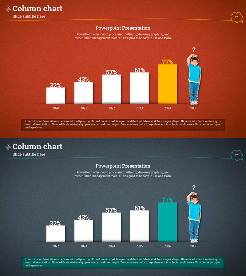
A vertical bar chart PowerPoint slide that visualizes year-over-year growth trends from 2020 to 2030. The slide displays six data points (32%, 43%, 57%, 61%, 77%) with the final bar highlighted in a contrasting color (yellow or teal) to emphasize key performance or forecast values. This presentation slide effectively communicates market trends, customer analysis, and predictive data in business reports. Two color theme variations are included—a warm terracotta background and a cool dark gray background—allowing you to match your overall presentation aesthetic. The PPTX format enables quick customization of values, labels, and colors.
Usage Points
-
Main Usage
Ideal for comparing numerical changes over time—such as annual revenue, quarterly sales, monthly customer growth, or year-over-year performance metrics. The highlighted final bar draws attention to target values, forecasts, or critical period achievements, making it perfect for executive summaries and investor presentations.
-
How to Use
Open the slide and replace the sample percentages (32%, 43%, 57%, 61%, 77%) with your actual data. Bar heights and labels adjust automatically. Customize background colors and bar colors to match your brand or presentation theme. Insert directly into business reports, pitch decks, or quarterly reviews without additional design work.
-
Recommended For
Executive briefings, investor pitch meetings, marketing team performance reviews, sales results presentations, market research findings, and quarterly business updates. Particularly suited for B2B presentations where objective, data-driven insights are essential and visual clarity is paramount.
-
Slide Structure
Six vertical bars representing six data points, each labeled with percentage values displayed above. The final bar is highlighted in yellow or teal to emphasize importance. The remaining five bars are white. Year labels (2020–2030) appear below each bar, with a descriptive text area at the bottom and title/subtitle space at the top for context.
Related Products
-

Bar Graph Visualizing Elderly Population Ratio
#Market and Competitor Analysis #Graph #Other
-

Soccer Illustration and Vertical Bar Graph – Market Analysis and Business Strategy Product
#Business Strategy #Market and Competitor Analysis #Graph
-

Visualizing Causes of Workplace Stress with Horizontal Bar Graph
#Market and Competitor Analysis #Graph #Customer Analysis
-

Customer Analysis People Icon Graph – Insights and Data Visualization
#Market and Competitor Analysis #Graph #Customer Analysis
