Scientific Development Status and Doughnut Chart – Visual Data Representation
RJ0500010_32
- Last Update 06/10/2025
- File Size 0.4MB
- # of Slides 2
- File Format PPTX
- Slide Ratio 16:9
- Color
Keywords
- #Content-Based Slides
- #Design-Based Slides
- #Product/Service Introduction
- #Financial Plans and Performance
- #Graph
- #Development Status
- #Projected Return on Investment (ROI)
- #Circles
- #Doughnut Chart
- #16:9
- #doughnut chart PowerPoint
- #pie chart slide template
- #ratio data visualization
- #3-item comparison chart
- #donut graph presentation
About the Product
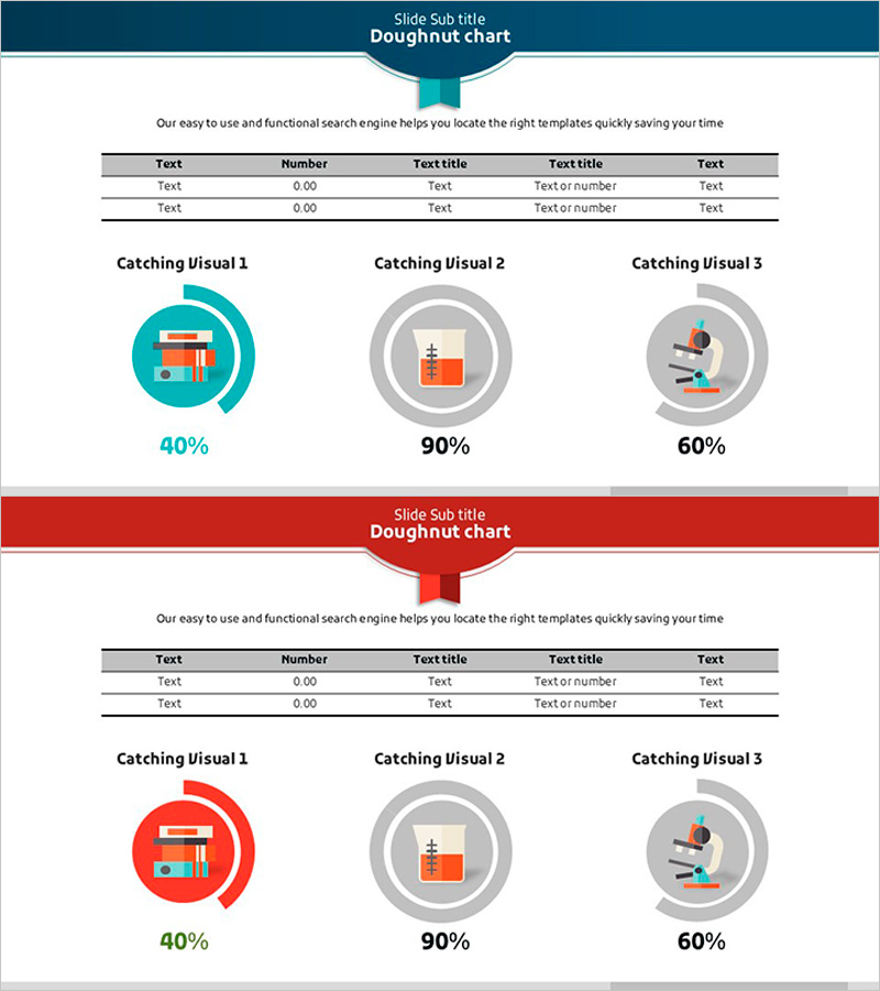
A 2-slide PowerPoint presentation featuring doughnut charts for visualizing development status, financial performance, and return on investment. Available in two color versions—teal and red—each slide includes three doughnut charts with a data input table and icon-based explanation areas. The circular graph displays percentage values in the center, enabling intuitive communication of ratio data. Ready-to-use for scientific reports, financial presentations, and business performance reviews.
Usage Points
-
Main Usage
Visualize three-item ratio data such as development progress, financial performance, ROI, and market share using doughnut charts. The percentage values displayed in the center of each donut clearly show the composition ratio of each item, enhancing audience comprehension.
-
How to Use
Enter data into the table area on the slide, and the doughnut charts update automatically. Choose between the teal or red version based on your presentation theme and brand colors. Edit the icon and text areas to add explanations for each data item.
-
Recommended For
Ideal for financial reports, business performance presentations, investor briefings, scientific research results, marketing analysis, and quarterly performance reviews. Suitable for executives, analysts, researchers, and marketing professionals who need data-driven decision-making visuals.
-
Slide Structure
Each slide features a header area at the top, a 5×5 data input table in the center, and three doughnut charts with icon explanations at the bottom. Each doughnut chart displays a percentage value in the center, with sample data showing 40%, 90%, and 60% respectively.
Related Products
-

Green & Gray Wide Donut Chart Template – Product and Operational Planning
#Product/Service Introduction #Financial Plans and Performance #Graph
-

Modern Business Plan PowerPoint Template – Visualizing Financial Performance with Infographic Elements
#Product/Service Introduction #Financial Plans and Performance #Graph
-

Big Data Technology Analysis Graph – Market Share Visualization
#Product/Service Introduction #Market and Competitor Analysis #Diagram
-

Shopping Status Analysis Graph – Effective Data Presentation
#Product/Service Introduction #Graph #Composition
