Big Data Market Analysis Graph – Trends and Performance
RJ0400071_15
- Last Update 06/06/2025
- File Size 5.2MB
- # of Slides 2
- File Format PPTX
- Slide Ratio 16:9
- Color
Keywords
- #Content-Based Slides
- #Design-Based Slides
- #Market and Competitor Analysis
- #Financial Plans and Performance
- #Diagram
- #Graph
- #Market Analysis
- #Income Statement
- #Table
- #Column
- #Standard Table
- #Segmented Column
- #16:9
- #stacked bar chart PowerPoint
- #vertical bar graph template
- #multi-series data visualization
- #annual trends chart slide
- #time-series data PowerPoint
- #how to create stacked bar chart in PowerPoint
About the Product
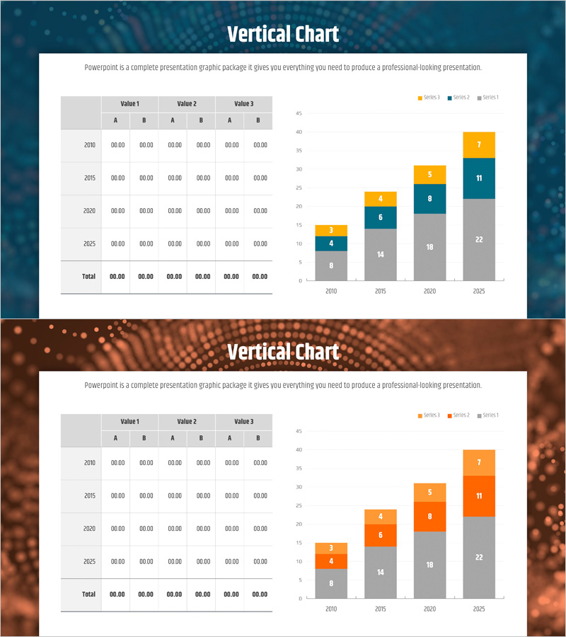
A stacked vertical bar chart PowerPoint slide that visualizes multi-series data changes across years from 2010 to 2025. This presentation template displays four data series in a cumulative format, allowing simultaneous comparison of total annual values and individual series contributions. The slide includes both a data table and corresponding chart for immediate use in business presentations and reports. Perfect for expressing market analysis, financial performance, revenue composition, and growth trends in professional PowerPoint presentations.
Usage Points
-
Main Usage
This slide is designed to clearly compare and analyze cumulative multi-series data trends across years. It enables simultaneous viewing of total annual scale and series composition ratios, making it ideal for expressing market growth, revenue composition, cost distribution, and other cumulative data representations.
-
How to Use
Enter actual numerical values into the data table and the chart will automatically update. Modify the years (2010–2025) and values for the 4 series (Series 1–4) to match your presentation content. Insert directly into market analysis reports, financial performance presentations, and achievement evaluation materials.
-
Recommended For
Suitable for finance teams analyzing revenue and expenses, marketing teams tracking market share trends, executive reports on performance metrics, and investor presentations on business growth. Particularly useful for executive briefings comparing multi-year cumulative data, business plan presentations, and quarterly performance evaluations.
-
Slide Structure
Composed of a data table on the left (4 year rows + 1 total row, 3 Value groups × 2 columns = 6 columns) and a stacked vertical bar chart on the right (4 series, 4 years + legend). Chart Y-axis ranges 0–45, X-axis shows years 2010·2015·2020·2025, with each bar segment colored in gray, orange, blue, and yellow for series distinction.
Related Products
-

100% Stacked Column Chart by Subject – Effective Market Analysis
#Market and Competitor Analysis #Diagram #Graph
-

Business Income Statement Table – Visualizing Financial Performance
#Market and Competitor Analysis #Financial Plans and Performance #Diagram
-

Orange Purple Subdivided Graph Table – Visualizing Market Data
#Market and Competitor Analysis #Diagram #Graph
-

Subdivided Bar Graph for Visual Market Analysis – Presenting Competitive Data Effectively
#Market and Competitor Analysis #Diagram #Graph
