Subdivided Graphs and Tables Slide – Market Analysis and Performance Data
RJ0300038_18
- Last Update 04/28/2025
- File Size 0.1MB
- # of Slides 2
- File Format PPTX
- Slide Ratio 16:9
- Color
Keywords
- #Content-Based Slides
- #Design-Based Slides
- #Market and Competitor Analysis
- #Financial Plans and Performance
- #Diagram
- #Graph
- #Market Analysis
- #Key Financial Indicators
- #Table
- #Column
- #Standard Table
- #Segmented Column
- #16:9
- #subdivided bar chart PowerPoint
- #multi-series chart slide template
- #market analysis data visualization
- #financial performance chart
- #comparative data presentation
About the Product
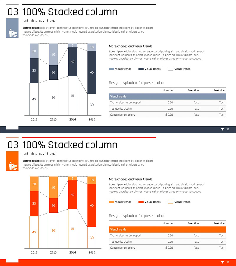
A comprehensive PowerPoint slide featuring subdivided bar charts and data tables for presenting market analysis and financial performance metrics. The 2-slide set includes a first slide with both vertical and horizontal bar charts displaying four data series across multiple years, enabling multi-dimensional data comparison. The second slide presents structured numerical data in table format with clear row-by-row organization. The design uses a professional two-tone color scheme of blue and dark navy, with precise numerical labels on each data point for enhanced audience comprehension. Optimized for 16:9 widescreen format and fully editable in PPTX, making it ready for immediate customization and deployment.
Usage Points
-
Main Usage
Visualize and compare multiple data metrics simultaneously—such as market trends, financial performance, sales figures, and quarterly results. The dual bar chart approach (vertical and horizontal) provides comprehensive data perspective, improving audience understanding and decision-making confidence.
-
How to Use
Ideal for business reports, investor presentations, marketing strategy reviews, and quarterly performance briefings. Simply replace the sample data, adjust colors and labels to match your dataset, and the slide is ready for immediate use in executive meetings or stakeholder communications.
-
Recommended For
Finance professionals, marketing managers, business analysts, management consultants, and data-driven decision makers. Particularly suited for annual/quarterly performance reports, market research presentations, C-suite briefings, and strategic planning sessions.
-
Slide Structure
Slide 1: Vertical bar chart (2012–2015 trend analysis) and horizontal bar chart (category comparison) positioned side-by-side, displaying 4 data series with legend. Slide 2: Structured data table with blue header row, category labels, numerical values, and descriptive text columns. Navy accent elements emphasize key metrics.
Related Products
-

Business Plan Presentation Template - Radial Diagram & Table
#Market and Competitor Analysis #Financial Plans and Performance #Diagram
-

Company Key Financial Indicators Table Slide
#Market and Competitor Analysis #Financial Plans and Performance #Diagram
-

Subdivided Bar Graph for Visual Market Analysis – Presenting Competitive Data Effectively
#Market and Competitor Analysis #Diagram #Graph
-

100% Stacked Column Chart by Subject – Effective Market Analysis
#Market and Competitor Analysis #Diagram #Graph
