Big Data Analysis Template Intro
RJ0400071_10
- Last Update 06/06/2025
- File Size 5.2MB
- # of Slides 2
- File Format PPTX
- Slide Ratio 16:9
- Color
Keywords
- #Content-Based Slides
- #Design-Based Slides
- #Market and Competitor Analysis
- #Graph
- #Competitor Analysis
- #Market Analysis
- #Column
- #Line
- #Column Chart
- #Line Chart
- #16:9
- #line chart PowerPoint slide
- #dual-series data visualization
- #trend analysis presentation template
- #big data PPT slide
- #market analysis chart template
About the Product
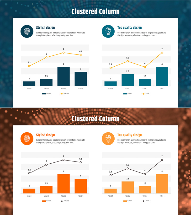
A professional line chart PowerPoint slide designed for visualizing big data analysis and market trends with dual data series. This presentation template combines line graphs with clustered column charts to simultaneously display trend progression and comparative values. The left slide features a dark blue background with yellow line series highlighting upward trends, while the right slide uses a warm orange tone with teal line series showing volatility patterns. Each chart displays four data points connected by lines, with corresponding bar values below for comprehensive data representation. Fully editable PPTX format allows you to input your own data and automatically update both line and column elements. Two color variations enable flexible design integration across different presentation sections.
Usage Points
-
Main Usage
Effectively communicate changes in two or more data series over time by combining line graphs for trend visualization with column charts for absolute value emphasis. Ideal for presenting big data analytics, market trends, competitive benchmarking, revenue progression, and other quantitative business insights that require multi-dimensional comparison.
-
How to Use
Two slides with distinct color themes (dark blue and warm orange) allow you to maintain consistent visual hierarchy across presentation sections. Simply input your line chart data points and column values into the editable fields, and both chart types automatically update. Customize legend labels, axis titles, and data ranges to match your specific analysis requirements.
-
Recommended For
Data analysts, marketing professionals, business executives, management consultants, and academic presenters who need to demonstrate quantitative findings with credibility. Particularly effective for quarterly performance reviews, competitive analysis reports, market share evolution, customer satisfaction trends, and multi-variable business metrics.
-
Slide Structure
Each slide features a title and description area at the top, dual-series line charts in the center (4 data points per series), and clustered column charts below (4 categories). Left chart uses yellow line series; right chart uses teal line series. Both are supported by corresponding bar values for comprehensive data storytelling.
Related Products
-

Three-Curve Graph for Market Trend Analysis – Differentiation from Competitors
#Market and Competitor Analysis #Graph #Competitor Analysis
-

Note Line Graph for Market and Competitor Analysis
#Market and Competitor Analysis #Graph #Competitor Analysis
-

Car Wide Template Line Chart 2 – Market Analysis and Competitor Comparison
#Market and Competitor Analysis #Diagram #Graph
-

Vertical Bar Standard Color Chart for Market Analysis – Market and Competitor Analysis
#Market and Competitor Analysis #Graph #Competitor Analysis
