Medical Experimental Research Data Analysis Slide – Market and Competitor Analysis
RJ0700019_7
- Last Update 07/27/2025
- File Size 1.3MB
- # of Slides 2
- File Format PPTX
- Slide Ratio 16:9
- Color
Keywords
About the Product
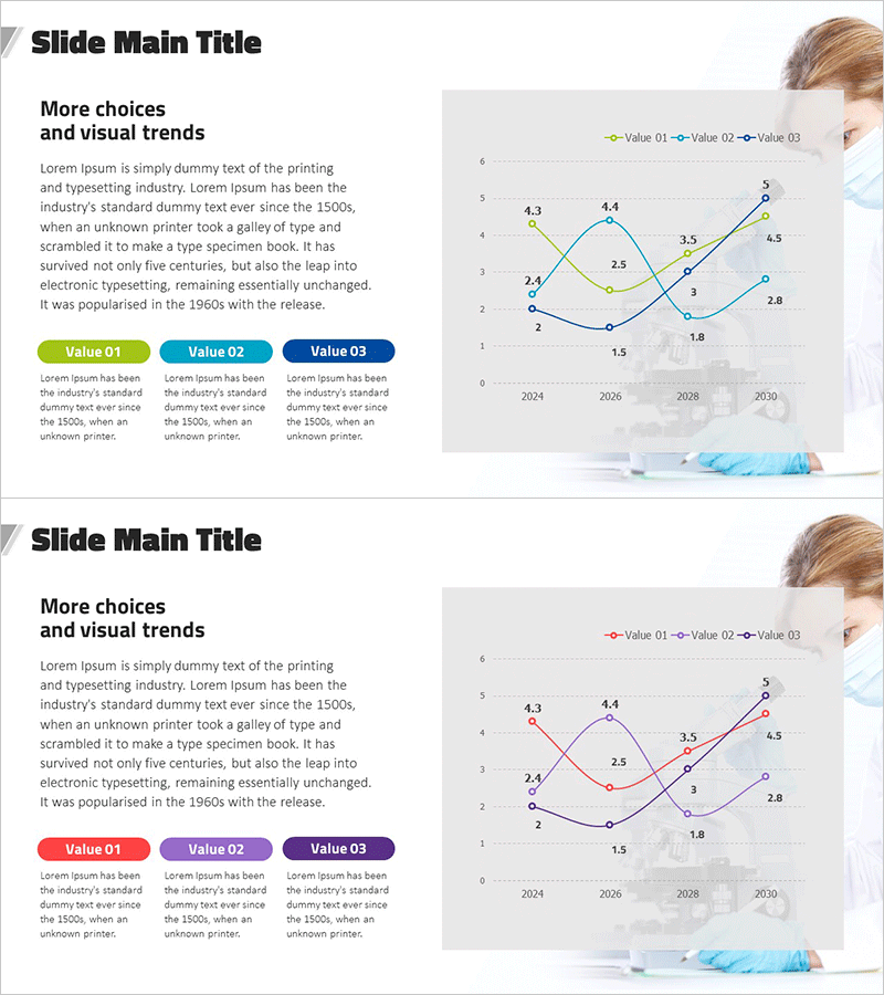
A multi-series line chart PowerPoint slide designed for medical research and market analysis data visualization. This presentation template displays three data series (Value 01, 02, 03) in lime, cyan, and navy blue colors, tracking trends from 2024 to 2030. The layout combines a left-side text area with three value boxes for key metrics and a large line graph on the right side showing comparative trends. Ideal for medical research presentations, competitive analysis reports, market trend analysis, and clinical data visualization in healthcare and pharmaceutical contexts.
Usage Points
-
Main Usage
Designed to compare three data series over time, this slide excels at visualizing medical research metrics, market indicators, and competitive performance trends from 2024 to 2030. Perfect for healthcare presentations, clinical research reports, pharmaceutical market analysis, and medical industry trend discussions.
-
How to Use
Enter analysis context and key messages in the left text area, then populate the three value boxes with primary metrics for each series. Replace the line chart data points and series labels with your actual data while maintaining the color scheme, or customize colors to match your organization's branding.
-
Recommended For
Medical researchers, clinical data analysts, healthcare marketing professionals, pharmaceutical strategy teams, medical device sales representatives, and healthcare consultants presenting research findings, market trends, competitive analysis, and clinical outcomes.
-
Slide Structure
Two-slide template with each slide divided into left and right sections. Left side features text content area and three labeled value boxes (Value 01, 02, 03). Right side displays a line graph with X-axis years (2024, 2026, 2028, 2030), Y-axis values (0–6), and three data series represented by lime, cyan, and navy lines with circular data point markers.
Related Products
-

Competitor Technology Comparison Graph – Market and Competitor Analysis
#Market and Competitor Analysis #Graph #Competitor Analysis
-

Virus Analysis Broken Line Graph – Market and Competitor Analysis
#Market and Competitor Analysis #Graph #Competitor Analysis
-

Competitor Analysis PC Mockup Graph – Market Trends and Insights
#Market and Competitor Analysis #Graph #Other
-

Market Analysis Graph & Notebook Mockup – Understanding the Market through Data Visualization
#Market and Competitor Analysis #Graph #Other
