Financial Analysis Circular Bar Chart – Optimized Template for Market and Competitor Analysis
RJ0400066_10
- Last Update 06/05/2025
- File Size 1.1MB
- # of Slides 2
- File Format PPTX
- Slide Ratio 16:9
- Color
Keywords
About the Product
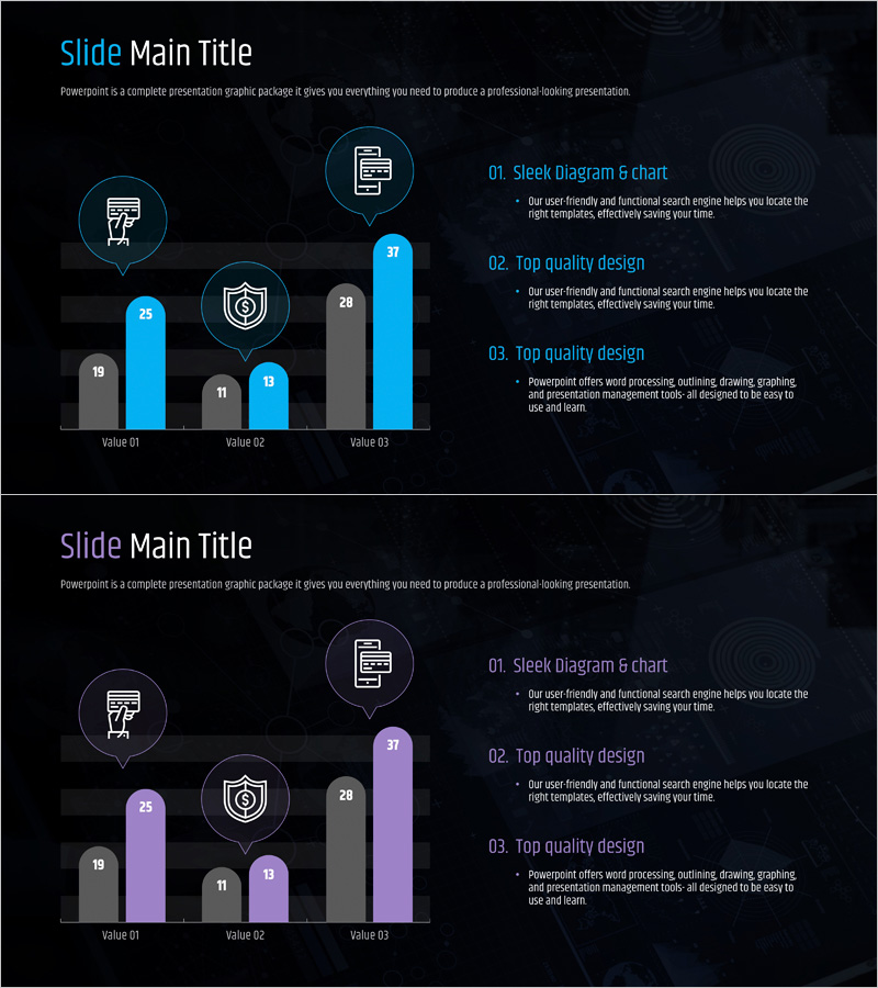
A grouped bar chart PowerPoint slide optimized for financial analysis and competitive market comparison. The slide features horizontal bars in three series (cyan, blue, and gray) on a dark background, displaying numerical comparisons across Value 01, 02, and 03. Category icons (document, mobile device, security shield) are positioned above each bar group to reinforce meaning, while a numbered text area on the right accommodates analysis details. The 2-slide set includes a color variant (cyan, purple, gray) to match your presentation tone. Fully editable PPTX format allows you to modify values, labels, icons, and colors instantly.
Usage Points
-
Main Usage
Use this slide when comparing three or more numerical series simultaneously, such as financial metrics, market data, or competitor benchmarks. Icons above the bars visually emphasize each category's meaning, while the right-side text area supports adding analysis findings, insights, and recommendations to drive data-informed decision-making.
-
How to Use
Replace the sample values (19, 25, 11, 13, 28, 37) with your actual data in the slide master. Update the labels (Value 01, 02, 03) to your analysis categories. Fill in the numbered text boxes (01, 02, 03) on the right with your analysis content. Swap icons or adjust colors as needed. Select the color variant (cyan-blue-gray or cyan-purple-gray) that matches your presentation background.
-
Recommended For
Ideal for finance, investment, consulting, and marketing teams presenting quarterly performance analysis, competitor benchmarking, and market research findings. Effective for executive briefings, board meetings, and client presentations where multiple metrics require objective comparison.
-
Slide Structure
Horizontal grouped bar chart with 3 series (cyan, blue, gray or cyan, purple, gray) arranged across 3 values (Value 01, 02, 03). Category icons (3 total) positioned above bar groups. Right side contains 3 numbered text boxes (01, 02, 03) for supplementary analysis text.
Related Products
-

Successful Business Analysis Graph – Market and Competitor Analysis
#Market and Competitor Analysis #Graph #Competitor Analysis
-

Paper Theme Table Chart & Bar Graph – Market Analysis and Competitive Strength
#Market and Competitor Analysis #Diagram #Graph
-

Market Analysis Bundle Vertical Bar Graph – Effective Data Visualization
#Market and Competitor Analysis #Graph #Competitor Analysis
-

Note Illustration Theme Chart – Market Analysis and Competitor Insights Tool
#Market and Competitor Analysis #Diagram #Graph
