Comparative Analysis of Vertical Bar Bundles
RJ0300093_12
- Last Update 05/15/2025
- File Size 1MB
- # of Slides 2
- File Format PPTX
- Slide Ratio 16:9
- Color
Keywords
About the Product
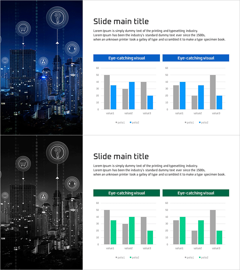
A 2-slide PowerPoint presentation featuring vertical bar clustered charts for comparative analysis. Each slide displays 5 categories with 2 data series positioned side-by-side, enabling clear item-by-item comparison. The left side features a dark blue cityscape background, while the right side presents white content area with blue and gray bar series. Ideal for market analysis, competitive benchmarking, performance metrics comparison, and quantitative data presentations that require immediate deployment.
Usage Points
-
Main Usage
Visualizes quantitative data comparison across categories and series with clarity. The side-by-side bar arrangement enables instant recognition of numerical differences between series within each category, making it suitable for market size comparison, competitive performance analysis, quarterly sales comparison, and regional performance benchmarking.
-
How to Use
Replace the 5 category labels and bar heights with your actual data values. Customize the blue and gray series colors to match your organization's brand palette, or adjust the number of categories to 3 or 6 as needed. The cityscape background conveys professionalism ideal for technology, finance, and business presentations.
-
Recommended For
Marketing professionals presenting market analysis, sales teams reporting competitive benchmarks, finance teams comparing quarterly performance, strategy teams analyzing regional or divisional results, and consultants delivering client benchmarking presentations.
-
Slide Structure
2-slide deck. Each slide divided into left section (dark blue cityscape image) and right section (white content area). Right section contains 'Eye-catching visual' header followed by 2 vertical bar clustered charts. Each chart displays 5 categories (value1–value3) with 2 series (period1, period2) rendered in gray and blue bars.
Related Products
-

Grouped Bar Chart for Learning Categories
#Market and Competitor Analysis #Graph #Competitor Analysis
-

Comparative Analysis Vertical Chart – Market and Competitor Analysis
#Market and Competitor Analysis #Graph #Competitor Analysis
-

Marketing and Analysis Presentation Template – Professional Data Visualization Design
#Market and Competitor Analysis #Graph #Competitor Analysis
-

Layout Design Presentation Template - Column Charts
#Market and Competitor Analysis #Graph #Competitor Analysis
