Market Analysis 3D Graph – Visualizing Competitive Market Research
RJ0400064_5
- Last Update 06/04/2025
- File Size 0.2MB
- # of Slides 2
- File Format PPTX
- Slide Ratio 16:9
- Color
Keywords
- #Content-Based Slides
- #Design-Based Slides
- #Market and Competitor Analysis
- #Graph
- #Competitor Analysis
- #Market Analysis
- #Column
- #Grouped Column
- #16:9
- #clustered bar chart PowerPoint
- #3D chart slide template
- #market analysis presentation
- #competitive analysis PPT
- #data visualization slides
- #bar graph PowerPoint template download
About the Product
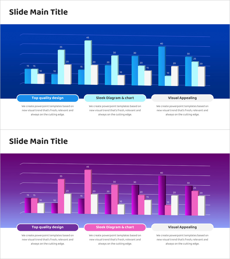
A professional 2-slide PowerPoint set featuring 3D clustered bar charts designed for market analysis and competitive research visualization. The slides showcase a dark blue background with light blue and white bar clusters, clear axis labels, and numeric data markers. Slide 1 displays multi-category comparative data across approximately 8–10 categories, while Slide 2 provides an alternative layout for flexible data presentation. Ideal for executive reports, marketing strategy presentations, market overview briefings, and investor pitch decks requiring data-driven insights.
Usage Points
-
Main Usage
Visualize competitive market research results and compare multiple data categories simultaneously using 3D bar clusters. The chart format effectively communicates relative data differences and strengthens credibility in executive reports and investor presentations by presenting market conditions with numerical precision.
-
How to Use
Input actual market data, competitor metrics, or sales figures into the clustered bar chart on slides 1 and 2. Customize axis labels and legend text to match your presentation context. The dark blue background with light blue and white bar clusters maintains professional appearance while remaining fully editable for your specific data requirements.
-
Recommended For
Marketing teams presenting market research findings, executive quarterly performance reviews, investment pitch decks, business strategy meetings, consulting firm client proposals, and B2B presentations requiring data-backed decision-making. Suitable for any scenario where multi-category numerical comparison is essential.
-
Slide Structure
2-slide set with 3D clustered bar charts. Slide 1 features approximately 8–10 categories with light blue and white bar clusters and numeric labels. Slide 2 offers an alternative layout for flexible data presentation. 16:9 widescreen format, fully editable PPTX with all chart elements customizable.
Related Products
-

Note Illustration Theme Chart – Market Analysis and Competitor Insights Tool
#Market and Competitor Analysis #Diagram #Graph
-

Competitor Comparison Analysis Bar Graph – Market Insights
#Market and Competitor Analysis #Graph #Competitor Analysis
-

Space Exploration Analysis Bar Graph
#Market and Competitor Analysis #Graph #Competitor Analysis
-

Startup Company Market Analysis Graph – Competition and Growth
#Market and Competitor Analysis #Diagram #Graph
