Data Analysis Bar Graph – Essential for Market and Competitor Analysis
RJ0400063_19
- Last Update 06/04/2025
- File Size 1.6MB
- # of Slides 2
- File Format PPTX
- Slide Ratio 16:9
- Color
Keywords
- #Content-Based Slides
- #Design-Based Slides
- #Market and Competitor Analysis
- #Graph
- #Competitor Analysis
- #Market Analysis
- #Horizontal Bar
- #Horizontal Bar Chart
- #16:9
- #horizontal bar chart PowerPoint
- #bar graph slide template
- #data comparison chart
- #market analysis PowerPoint
- #competitive analysis slide
About the Product
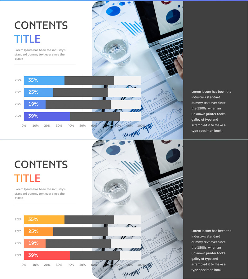
A horizontal bar chart PowerPoint slide optimized for market analysis and competitive benchmarking. This presentation template displays data across four years (2024–2021) in a side-by-side comparison format, making it easy to visualize performance metrics and trends. The design uses a bright blue color scheme for primary data bars contrasted against gray background bars, ensuring clear numerical differentiation. The slide deck is ready to use in marketing plans, business analysis reports, performance summaries, and strategic presentations. Simply replace the sample data with your own figures to create a professional analysis slide.
Usage Points
-
Main Usage
Displays quantitative data across multiple time periods or categories in a horizontal bar format, enabling quick visual comparison. Ideal for presenting sales figures, market share, growth rates, and performance metrics where year-over-year or period-over-period analysis is required.
-
How to Use
Insert this slide into the market analysis section of marketing plans, competitive analysis pages of business proposals, or quarterly and annual performance reports. Adjust bar lengths to match your actual data, add value labels and legends, and customize colors if needed to align with your brand guidelines.
-
Recommended For
Marketing professionals, business analysts, financial planners, management consultants, and data-driven decision makers. Particularly useful for presenting market research findings, competitor benchmarking results, quarterly performance reviews, and strategic business analysis.
-
Slide Structure
Two-slide template featuring horizontal bar charts with four data series (2024, 2023, 2022, 2021). Each slide includes a 0–100% horizontal axis with year labels, blue primary bars, and gray reference bars for clear numerical comparison and visual hierarchy.
Related Products
-

Competitive Hotel Service Comparison Analysis Diagram
#Market and Competitor Analysis #Graph #Competitor Analysis
-

Logistics Industry Progress Analysis Graph – Market Insight
#Market and Competitor Analysis #Graph #Competitor Analysis
-

Interest Type Analysis for Children – Market and Competitor Analysis
#Market and Competitor Analysis #Graph #Competitor Analysis
-

Pencil Bar Chart for Market Analysis – Visual Competitiveness
#Market and Competitor Analysis #Graph #Other
