Mobile Market Analysis Graph – Insights on Market Trends
RJ0400062_17
- Last Update 06/04/2025
- File Size 0.8MB
- # of Slides 2
- File Format PPTX
- Slide Ratio 16:9
- Color
Keywords
- #Content-Based Slides
- #Design-Based Slides
- #Market and Competitor Analysis
- #Diagram
- #Graph
- #Competitor Analysis
- #Market Analysis
- #Cluster
- #Horizontal Bar
- #Closed Cluster Diagram
- #Grouped Horizontal Bar
- #16:9
- #horizontal bar chart PowerPoint
- #grouped bar graph presentation
- #market analysis slide
- #data comparison chart
- #multi-color graph template
About the Product
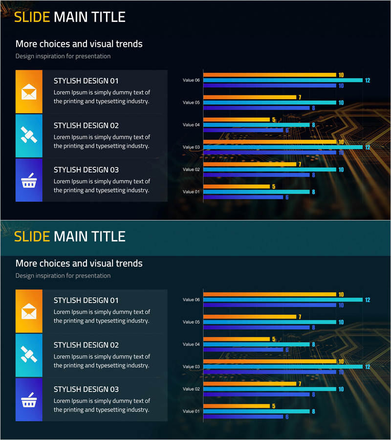
A horizontal bar chart PowerPoint slide optimized for mobile market analysis and competitive comparison. This presentation template features six data items displayed simultaneously using four color series—orange, blue, purple, and cyan—with clear numerical labels at the end of each bar. The bright color bars contrast sharply against the dark background, ensuring data visibility on projection screens. Ideal for comparing market trends, sales performance, customer satisfaction, and technology evaluation metrics. Ready to use in marketing strategy presentations, business reports, and executive briefings with instant customization.
Usage Points
-
Main Usage
Compare multiple data items simultaneously—mobile market analysis, competitor performance benchmarking, market share evaluation, and customer satisfaction assessment. Clear numerical labels support quantitative evidence presentation in business contexts.
-
How to Use
Insert into the market analysis section of marketing strategy decks, performance evaluation pages in business reports, or competitive analysis slides in executive presentations. Data automatically adjusts bar length and values when you input your figures, enabling immediate presentation use.
-
Recommended For
Marketing managers, business planning teams, executive reporting specialists, market research analysts, and sales strategy professionals presenting market trends, competitive positioning, and performance metrics.
-
Slide Structure
Two-slide set, each displaying six data items as horizontal bars. Four color series—orange, blue, purple, cyan—differentiate data categories. Numerical labels appear at bar ends. Dark background with bright color contrast maximizes data readability.
Related Products
-

Mobile App Usage Analysis Graph – Insights for Competitor Analysis
#Market and Competitor Analysis #Graph #Competitor Analysis
-

Competitor Market Analysis Broken Line Graph – Enhance Business Strategy with Data Visualization
#Market and Competitor Analysis #Diagram #Graph
-

Competitor Analysis Broken Line Graph – Visualizing Market Trends
#Market and Competitor Analysis #Diagram #Graph
-

Social Network Business Market Analysis Chart – Effective Data Visualization
#Market and Competitor Analysis #Graph #Competitor Analysis
