In-depth Analysis Diagrams & Charts – Insightful Technical Analysis
RM0900002_13
- Last Update 03/02/2025
- File Size 0.3MB
- # of Slides 2
- File Format PPTX
- Slide Ratio 16:9
- Color
Keywords
- #Content-Based Slides
- #Design-Based Slides
- #Technical Approach
- #Market and Competitor Analysis
- #Diagram
- #Graph
- #Research and Development
- #Market Analysis
- #Cluster
- #Horizontal Bar
- #Closed Cluster Diagram
- #Grouped Horizontal Bar
- #16:9
- #in-depth analysis diagram PowerPoint
- #circular chart slide template
- #horizontal bar chart presentation
- #technical analysis slides
- #data visualization PowerPoint template
About the Product
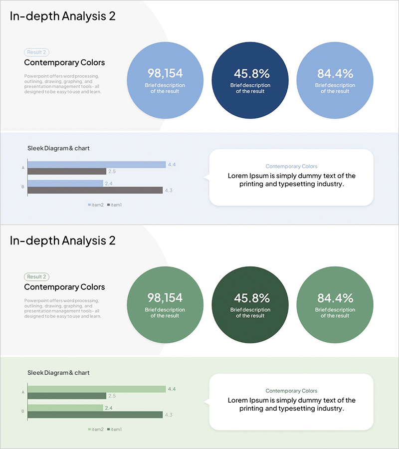
A 2-slide PowerPoint presentation designed to visualize technical analysis and market insights at a glance. The first slide features three circular diagrams displaying key metrics (98,154 / 45.8% / 84.4%), while the second slide presents a horizontal bar chart comparing four data items. Available in both blue and green color schemes to match your presentation tone. Delivered in 16:9 widescreen PPTX format, fully editable and ready to customize with your own data.
Usage Points
-
Main Usage
Present complex technical data and market metrics using dual visualization methods—circular diagrams for individual metrics and bar charts for comparative analysis. Enhances audience comprehension and reinforces data credibility in professional presentations.
-
How to Use
Replace the sample metrics in the three circular diagrams on slide 1 with your actual data. Update the four comparison items and values in the horizontal bar chart on slide 2. Select either the blue or green version based on your brand colors and presentation theme.
-
Recommended For
Ideal for technical reports, market analysis presentations, quarterly performance reviews, investor pitch decks, and consulting proposals. Recommended for analysts, consultants, business strategists, and executives who need to communicate quantitative insights effectively.
-
Slide Structure
Slide 1: Three circular diagrams (light blue, dark blue, light blue OR light green, dark green, light green) displaying numerical metrics / Slide 2: Horizontal bar chart with 4 items and 2 data series plus explanatory text box
Related Products
-

Mobile Market Analysis Graph – Insights on Market Trends
#Market and Competitor Analysis #Diagram #Graph
-

Horizontal Bar Chart for Data Visualization – Stylish Presentation
#Technical Approach #Market and Competitor Analysis #Graph
-

SWOT Analysis Closed Square Diagram
#Market and Competitor Analysis #Diagram #SWOT Analysis
-

Healthcare Services Analytics Donut Chart – Insights into Competitive Markets
#Market and Competitor Analysis #Diagram #Graph
