Doughnut Chart Visualizing Current Status of 3D Printing Technology Development
RJ0400036_28
- Last Update 05/27/2025
- File Size 0.5MB
- # of Slides 2
- File Format PPTX
- Slide Ratio 16:9
- Color
Keywords
- #Content-Based Slides
- #Design-Based Slides
- #Product/Service Introduction
- #Market and Competitor Analysis
- #Graph
- #Development Status
- #Market Share
- #Circles
- #Doughnut Chart
- #16:9
- #doughnut chart PowerPoint
- #pie chart slide template
- #ratio visualization PowerPoint
- #3-item comparison slide
- #data visualization template
- #donut chart download
About the Product
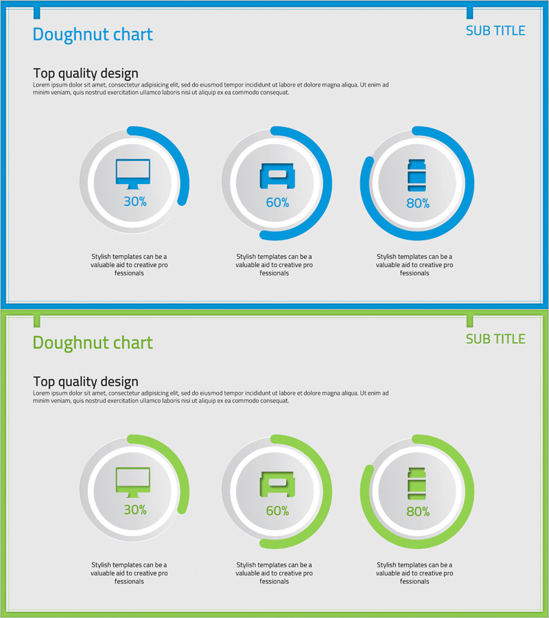
A PowerPoint slide that visualizes the ratio of three items using doughnut charts. The slide features two color versions: blue and green. Each doughnut chart displays a centered icon (monitor, sofa, or stacked layers) with percentage values positioned on the outer ring. The 2-slide set presents the same layout in different color schemes, allowing you to select the version that best matches your presentation theme. Ideal for communicating ratio-based data such as technology development status, market share, competitive analysis, and performance metrics.
Usage Points
-
Main Usage
Effectively compare and display the ratio of three items such as technology development status, market share, competitive analysis, product feature distribution, and customer satisfaction levels. The centered icon area in each doughnut chart enables intuitive communication of each item's meaning.
-
How to Use
Edit the percentage values and icons in each doughnut chart to match your data. Select either the blue or green version based on your presentation theme and overall slide design. The centered icons can be replaced with images that represent the characteristics of your items.
-
Recommended For
Engineers presenting technology and product development status, marketing professionals preparing market analysis reports, planners creating executive presentations, and researchers explaining data ratios in academic presentations.
-
Slide Structure
2-slide set with 3 doughnut charts arranged horizontally on each slide. Each chart consists of a centered icon (monitor, sofa, or stacked layers), outer ring percentage display (30%, 60%, 80%), and descriptive text below. Slide 1 features blue color scheme; Slide 2 features green color scheme.
Related Products
-

Sales Status Analysis Graph – Simple and Stylish Design
#Product/Service Introduction #Market and Competitor Analysis #Graph
-

City Theme Market Share Graph – Business Data Visualization
#Product/Service Introduction #Market and Competitor Analysis #Graph
-

Analysis graph of market share progress
#Product/Service Introduction #Market and Competitor Analysis #Graph
-

Graph of Analysis of Transportation Development Status
#Product/Service Introduction #Market and Competitor Analysis #Graph
