Analysis of Transportation Usage Status – Pie Chart
RJ0300091_5
- Last Update 05/14/2025
- File Size 4MB
- # of Slides 2
- File Format PPTX
- Slide Ratio 16:9
- Color
Keywords
- #Content-Based Slides
- #Design-Based Slides
- #Product/Service Introduction
- #Market and Competitor Analysis
- #Graph
- #Development Status
- #Market Share
- #Circles
- #Doughnut Chart
- #16:9
- #donut pie chart PowerPoint
- #pie chart slide template
- #3-segment ratio analysis PPT
- #transportation usage chart
- #market share visualization PowerPoint
About the Product
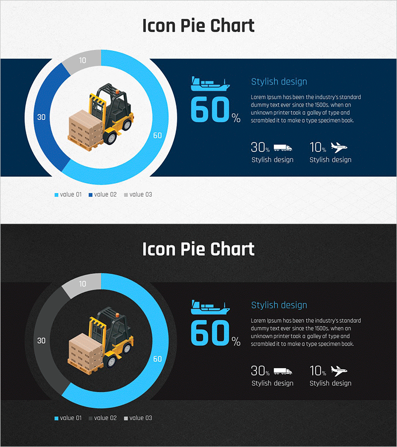
A donut-shaped pie chart PowerPoint slide designed to visualize transportation usage status, market share, sales distribution, and comparative data across three segments. The chart features a light blue, dark blue, and gray color palette with a central icon (forklift, ship, airplane) representing logistics and transportation industries. Includes two layout variations: light background and dark background for flexible presentation and print use. Fully editable PPTX format (16:9 widescreen) allows you to customize data values, labels, colors, and text instantly without design tools.
Usage Points
-
Main Usage
Donut pie charts excel at displaying proportional relationships and composition of data across 3–5 categories. Ideal for visualizing transportation usage patterns, market share distribution, sales breakdown, customer demographics, budget allocation, and industry comparisons. The central icon reinforces the topic and draws audience focus to key data insights.
-
How to Use
Perfect for executive reports, marketing proposals, business analysis presentations, academic conferences, investor pitch decks, and quarterly business reviews. Use the light background version for projector presentations and the dark background for printed materials and digital sharing across email and web platforms.
-
Recommended For
Logistics and transportation professionals, marketing and strategy teams, financial analysts, business executives, management consultants, students, and researchers presenting data-driven insights. Especially effective for industry market share analysis, regional distribution comparisons, and customer segment composition.
-
Slide Structure
Two-slide set featuring a donut pie chart (3 segments) with central icon, title area, descriptive text, and percentage labels. First slide uses light background (white and blue tones), second uses dark background. All elements—chart segments, colors, text, and numerical values—are fully editable and scalable.
Related Products
-

Stock Market Share Analysis Graph – Insights and Strategies
#Product/Service Introduction #Market and Competitor Analysis #Graph
-

Sales Status Analysis Graph – Simple and Stylish Design
#Product/Service Introduction #Market and Competitor Analysis #Graph
-

Map Donut Graph for Visualizing Market Share – Symbol of Practicality and Change
#Product/Service Introduction #Market and Competitor Analysis #Graph
-

Business Idea Development Status Graph – Ideas and Growth
#Product/Service Introduction #Market and Competitor Analysis #Graph
