Data Analysis Donut Circle Graph – Visual Representation for Market and Competitive Analysis
RJ0400026_24
- Last Update 05/24/2025
- File Size 0.2MB
- # of Slides 2
- File Format PPTX
- Slide Ratio 16:9
- Color
Keywords
- #Content-Based Slides
- #Design-Based Slides
- #Business Introduction
- #Market and Competitor Analysis
- #Graph
- #Technological Status
- #Competitive Advantage
- #Circles
- #Doughnut Chart
- #16:9
- #donut chart PowerPoint slide
- #pie chart template
- #data ratio visualization PPT
- #market analysis chart slide
- #competitive analysis graph PowerPoint
- #multi-layer donut chart template
About the Product
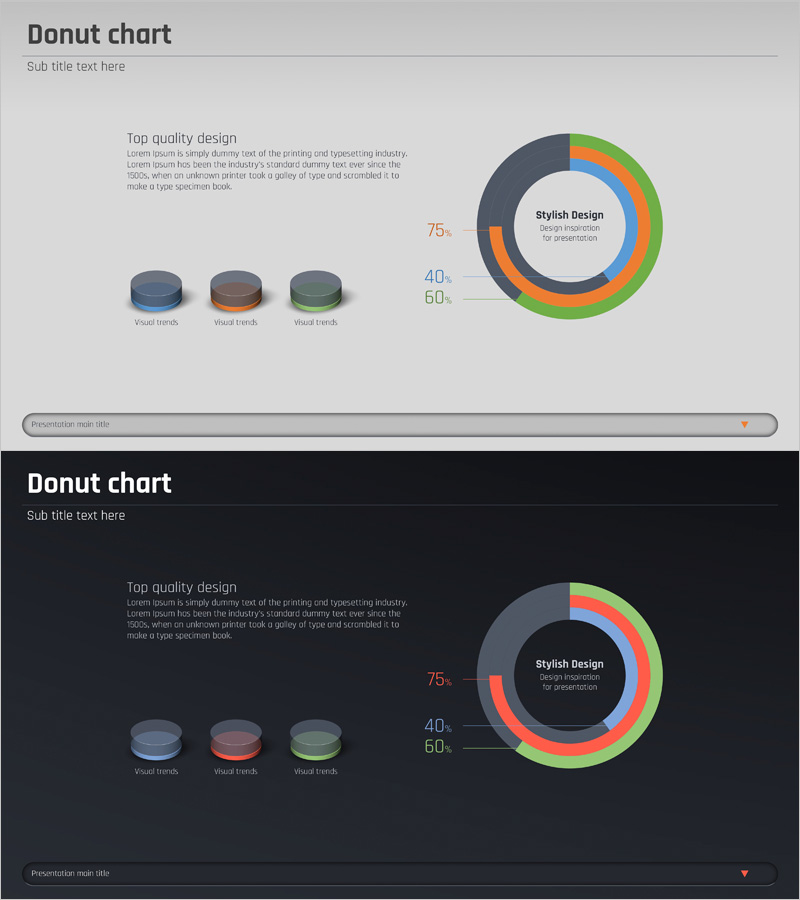
A professional donut chart PowerPoint slide optimized for market analysis and competitive comparison presentations. The multi-layered donut graph features three distinct colors—gray, orange, and green—to intuitively represent complex data ratios and proportions. This 2-slide set includes both light and dark background design options, allowing you to adapt to different presentation environments and lighting conditions. The central circular area accommodates your core message, while the left text section and numerical labels enable detailed explanations and data annotations. Ideal for business introductions, market overview presentations, competitive advantage analysis, and quarterly performance reports. Fully editable and ready for immediate use in PowerPoint.
Usage Points
-
Main Usage
Designed to visually represent complex data ratios and compositional relationships with clarity and impact. The multi-layered donut structure effectively communicates the relationship between whole and parts, while the central circular area emphasizes your key message and captures audience attention. Suitable for visualizing market share, customer segmentation, product portfolio composition, and other data-driven insights.
-
How to Use
Edit the donut chart colors and numerical values directly in the slide master to reflect your actual data. Add analysis content and key insights in the left text area, and input your core topic in the central circular region. Use the light background slide for bright meeting rooms and the dark background slide for dimly lit environments to ensure optimal readability.
-
Recommended For
Ideal for marketing professionals, business planners, financial analysts, consultants, and anyone requiring data-driven presentations. Perfect for business plans, market analysis reports, competitive analysis documents, investor pitch decks (IR), quarterly performance reports, and strategic planning presentations.
-
Slide Structure
2-slide set with each slide featuring a 3-layer donut chart as the focal point. The multi-color donut graph (gray, orange, green) is positioned on the right side with a central text area labeled 'Stylish Design'. The left section contains a title, descriptive text, and three 3D cylindrical visual elements. Numerical labels (75%, 40%, 60%) are displayed adjacent to the chart for data annotation.
Related Products
-

Solar System Pie Graph – Stylish Presentation Design
#Business Introduction #Market and Competitor Analysis #Graph
-

Core Transport Competitiveness Analysis – Intuitive Visualization with Graphs
#Market and Competitor Analysis #Graph #Competitor Analysis
-

Sensuous Doughnut Chart Slide – Market Share Analysis
#Market and Competitor Analysis #Diagram #Graph
-

User Experience Advantage Analysis Chart – Visualizing Competitive Edge
#Product/Service Introduction #Market and Competitor Analysis #Diagram
