Market Trend Line Graph – Business Strategy
RJ0400009_8
- Last Update 05/19/2025
- File Size 0.3MB
- # of Slides 2
- File Format PPTX
- Slide Ratio 16:9
- Color
Keywords
- #Content-Based Slides
- #Design-Based Slides
- #Business Strategy
- #Market and Competitor Analysis
- #Graph
- #Financial Outlook & Expected Impact
- #Industry Trends
- #Line
- #Line Chart
- #16:9
- #line graph PowerPoint
- #market trend presentation slide
- #data trend chart
- #business strategy graph
- #revenue forecast slide
- #line chart template download
About the Product
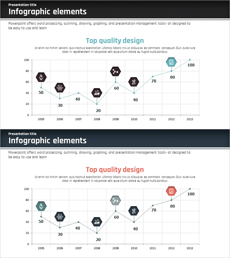
A PowerPoint slide presenting market trends from 2005 to 2013 using a line graph with 9 data points. The design features light blue connecting lines with hexagonal icon markers that emphasize each data point, supported by a grid background for easy numerical reading. This slide is ideal for business strategy presentations where you need to compare market growth rates, revenue forecasts, and competitor trends. The 2-slide set offers multiple marker color variations (blue, green, red) so you can match your presentation's tone. Formatted in 16:9 widescreen PPTX for seamless integration into modern presentation environments.
Usage Points
-
Main Usage
Visualizes numerical changes over time such as market growth rates, revenue trends, and competitor performance. Effectively supports business strategy development by comparing historical performance against future projections. The grid background and clear axis labels help audiences grasp precise data values at a glance.
-
How to Use
Insert into the market analysis or performance analysis sections of financial reports, business plans, and strategy presentations. Customize marker and line colors to represent multiple data series simultaneously (e.g., comparing sales of Company A, B, and C). Add a legend to clarify the meaning of each series for audience clarity.
-
Recommended For
Finance professionals, business planning teams, marketing strategists, and executives preparing board reports frequently use this template. Ideal for quarterly and annual performance reviews, new business feasibility studies, and investor pitch decks. Suitable for consulting firms, financial institutions, and manufacturing companies' executive presentations.
-
Slide Structure
Two-slide set with the first slide displaying 9 data points using light blue hexagonal markers and connecting lines. The second slide presents color variations with green and red markers. Both slides use a standard coordinate system with X-axis showing years (2005–2013) and Y-axis displaying values (0–100).
Related Products
-

Modern Business Presentation Template Line Chart
#Business Strategy #Market and Competitor Analysis #Graph
-

Diet Line Chart – Visualizing Business Strategy
#Business Strategy #Graph #Financial Outlook & Expected Impact
-

Market Trend Analysis of Traditional Tea – Market Share Changes
#Market and Competitor Analysis #Graph #Market Analysis
-

Market Overview and Growth Trend – Strategic Data Analysis
#Business Strategy #Market and Competitor Analysis #Diagram
