Diet Line Chart – Visualizing Business Strategy
RJ0600036_15
- Last Update 06/30/2025
- File Size 0.3MB
- # of Slides 2
- File Format PPTX
- Slide Ratio 16:9
- Color
Keywords
- #Content-Based Slides
- #Design-Based Slides
- #Business Strategy
- #Graph
- #Financial Outlook & Expected Impact
- #Achievements
- #Line
- #Line Chart
- #16:9
- #line chart PowerPoint
- #dual-series graph slide
- #business performance trend chart
- #revenue forecast PowerPoint
- #how to create line chart in PowerPoint
- #line graph slide template download
- #performance comparison chart
About the Product
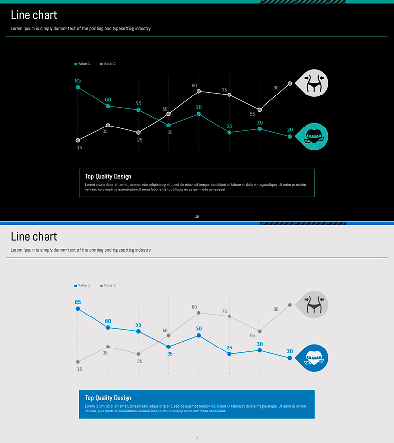
A dual-series line chart PowerPoint slide designed to visualize business performance trends and strategic progress over time. Available in two design themes—dark background and light background—each slide displays Value 1 and Value 2 data series with clearly marked numerical data points. Ideal for quarterly performance comparisons, revenue forecasting, and results analysis, this slide effectively communicates multi-metric trends in business dashboards and executive reports. Includes icon elements and text boxes for highlighting key insights, optimized for 16:9 widescreen presentation formats.
Usage Points
-
Main Usage
Express time-series data changes across two metrics simultaneously—such as quarterly revenue, profit margins, or KPI trends—enabling executives and stakeholders to compare performance trajectories and assess goal achievement at a glance. Commonly used in quarterly business reviews, strategic planning presentations, and performance analysis reports.
-
How to Use
Replace the sample data points (85, 60, 55, 50, etc.) with your actual figures and update the Value 1 and Value 2 legend labels to match your metrics (e.g., Revenue, Profit Margin). Customize the 'Top Quality Design' text box with key insights or conclusions relevant to your presentation context.
-
Recommended For
CFOs and finance teams presenting quarterly earnings, business unit leaders reporting performance results, marketing teams analyzing campaign effectiveness, sales teams tracking revenue trends, and management consultants preparing client proposals. Suitable for any business presentation requiring quantitative trend emphasis.
-
Slide Structure
Two-slide set: dark theme (black background with teal and white accents) and light theme (light gray background with blue and gray accents). Each slide features X-axis range 15–80, dual-line series with data point markers, legend, icon elements (top right), and text box (bottom). 16:9 widescreen format.
Related Products
-

Before and After Line Graph for Visualizing Profit Projections – Performance Strategy Presentation
#Business Strategy #Graph #Financial Outlook & Expected Impact
-

Revenue Growth Target Graph – Effective Performance Presentation
#Business Strategy #Graph #Financial Outlook & Expected Impact
-

Future Outlook and Expected Effects Graph – Harmony of Blue and Orange
#Business Strategy #Market and Competitor Analysis #Graph
-

Sewing Graph Chart – Market Status and Performance Analysis
#Business Strategy #Market and Competitor Analysis #Diagram
