Market Trend Line Graph – Effective Competitive Advantage Analysis
RJ0600027_19
- Last Update 06/27/2025
- File Size 0.2MB
- # of Slides 2
- File Format PPTX
- Slide Ratio 16:9
- Color
Keywords
About the Product
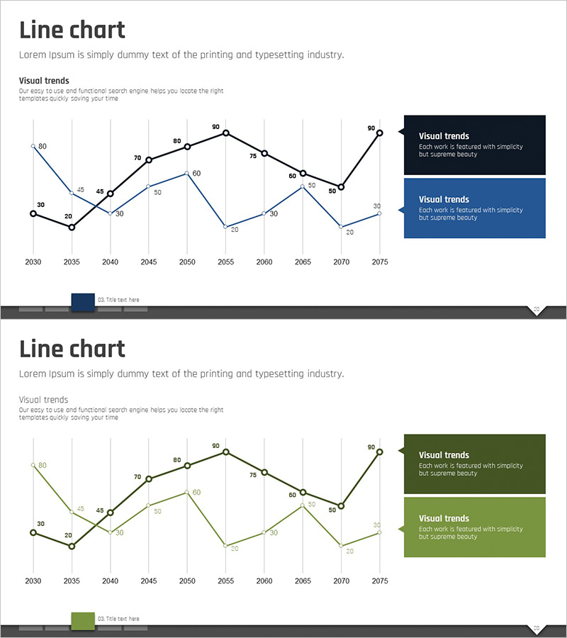
A PowerPoint slide template featuring a dual-series line chart comparing long-term market trends from 2030 to 2075. Black and blue lines intersect and diverge to clearly express changing trends, with numerical labels at each data point enabling precise value comparison. The grid background facilitates easy value reading, and a legend box (black and blue) on the right provides intuitive series differentiation. This presentation template is ready to use in reports, analyses, and business presentations for visualizing competitive comparisons, market trajectory shifts, and performance metrics.
Usage Points
-
Main Usage
Optimized for comparing two series of numerical changes over time, such as long-term market trends, competitor performance, and key metrics. The intersecting and diverging line patterns reveal relationships and trajectory shifts between the two series at a glance, while precise numerical labels support credible data communication.
-
How to Use
Insert into market analysis, competitive advantage analysis, or performance comparison sections of presentations. The structure automatically updates lines when existing data is entered, allowing visualization of diverse business metrics including annual performance comparisons, customer satisfaction trends, and sales volume changes. Customize the legend and axis labels to match your context.
-
Recommended For
Ideal for executives, marketing teams, sales teams, and analysts presenting business reports, strategy presentations, investor briefings, and market analysis materials. Particularly effective when expressing two or more series simultaneously, such as competitor benchmarking, market share evolution, product performance trends, and customer metric comparisons.
-
Slide Structure
Two-slide set. The first slide features black and blue lines representing 50 years of data from 2030 to 2075, with numerical values (30-90) displayed at each five-year data point. Grid background and Y-axis gridlines enable easy value comparison, with a legend box (black and blue) positioned on the right. The second slide offers the same structure in green tones, providing color scheme options.
Related Products
-

Line Chart Template for Market Trends Visualization – Enhancing Competitive Advantage
#Market and Competitor Analysis #Graph #Industry Trends
-

Plotting Paper Presentation Template - Analyzing Market Trends with Line Chart
#Market and Competitor Analysis #Graph #Industry Trends
-

Arctic Penguin Line Graph – Market Trend Analysis
#Market and Competitor Analysis #Graph #Industry Trends
-

Curved Line Chart – Market Trend Analysis
#Market and Competitor Analysis #Graph #Industry Trends
