Science Market Analysis Bundled Bar Graph
RJ0400009_29
- Last Update 05/19/2025
- File Size 0.3MB
- # of Slides 2
- File Format PPTX
- Slide Ratio 16:9
- Color
Keywords
- #Content-Based Slides
- #Design-Based Slides
- #Market and Competitor Analysis
- #Graph
- #Competitor Analysis
- #Market Analysis
- #Horizontal Bar
- #Grouped Horizontal Bar
- #16:9
- #bundled horizontal bar chart PowerPoint
- #3-series bar graph slide
- #data comparison template
- #market analysis chart
- #year-over-year comparison slide
About the Product
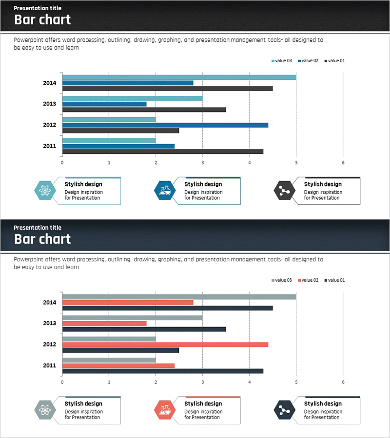
A bundled horizontal bar chart PowerPoint slide designed for science field market analysis presentations. This 2-slide set displays year-over-year data (2011–2014) with three distinct data series positioned side by side for easy comparison. The color scheme uses teal, navy, and gray tones to differentiate each series, while gridlines and a legend enhance data readability. Ideal for competitive analysis, market trend comparison, departmental performance review, and other business presentations requiring clear data visualization.
Usage Points
-
Main Usage
This chart excels at comparing quantitative data across years, departments, or competitors using three parallel data series. Perfect for market analysis, performance benchmarking, competitive positioning, and presenting numerical trends in a clear, side-by-side format.
-
How to Use
Bar length represents numerical values, while color coding distinguishes between the three data series. The legend and axis labels clarify data meaning, and gridlines facilitate value reading. Simply edit the text and numbers to match your dataset and customize colors as needed.
-
Recommended For
Executive reports, marketing plans, business proposals, market research presentations, financial analysis, departmental performance reviews, and investor pitches. Particularly valuable for science, technology, healthcare, finance, and research-driven industries.
-
Slide Structure
Two-slide layout featuring identical bundled horizontal bar chart designs. Each slide displays four years (2011–2014) with three data series (value 01, 02, 03) arranged horizontally. Includes horizontal axis (0–6 range), legend, title area, and gridlines for reference.
Related Products
-

Blue Orange Bundle Bar Graph - Insights for Market Analysis
#Market and Competitor Analysis #Graph #Competitor Analysis
-

Cybersecurity Business Market Analysis Graph
#Market and Competitor Analysis #Graph #Competitor Analysis
-

Mobile App Usage Analysis Graph – Insights for Competitor Analysis
#Market and Competitor Analysis #Graph #Competitor Analysis
-

Horizontal Bar Chart for Financial Business Market Analysis
#Market and Competitor Analysis #Graph #Competitor Analysis
