Blue Orange Bundle Bar Graph - Insights for Market Analysis
RJ0400016_17
- Last Update 05/21/2025
- File Size 0.4MB
- # of Slides 2
- File Format PPTX
- Slide Ratio 16:9
- Color
Keywords
- #Content-Based Slides
- #Design-Based Slides
- #Market and Competitor Analysis
- #Graph
- #Competitor Analysis
- #Market Analysis
- #Horizontal Bar
- #Grouped Horizontal Bar
- #16:9
- #grouped bar chart PowerPoint
- #horizontal bar graph template
- #data comparison slides
- #market analysis chart
- #competitive analysis PowerPoint
- #bar chart slide template
About the Product
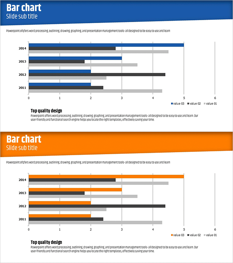
A 2-slide grouped horizontal bar chart PowerPoint template featuring blue and orange color themes for data visualization. This presentation slide set displays four data series across years (2011–2014), making it ideal for market analysis, competitive benchmarking, and performance trend reporting. The grouped bar layout enables direct comparison of multiple metrics within each time period. Designed in 16:9 widescreen PPTX format for modern presentation environments, with fully editable labels, legends, and data values for immediate use.
Usage Points
-
Main Usage
Display multi-series numerical data across time periods or categories using grouped horizontal bars. Ideal for comparing performance metrics, market share, departmental results, product sales by category, or competitive positioning where side-by-side comparison of multiple data series is essential.
-
How to Use
Slide 1 features the blue theme and Slide 2 the orange theme, allowing you to select the appropriate design for different sections or emphasis points in your presentation. Simply double-click the legend, axis labels, and bar values to input your own data; bar lengths adjust automatically.
-
Recommended For
Executive reports, business plans, marketing proposals, investor presentations, quarterly performance reviews, and market research reports. Recommended for finance teams, marketing departments, strategy units, and sales teams who need to communicate data-driven insights effectively.
-
Slide Structure
Each slide contains four data series (value 03, value 02, value 01, and legend) arranged horizontally across four years (2011–2014). Bars are aligned along a 0–6 horizontal axis with gridlines and a legend for easy interpretation. Dedicated title and description text areas are provided for context.
Related Products
-

Market Analysis Bundle Bar Graph - Effective Competitor Analysis
#Market and Competitor Analysis #Graph #Competitor Analysis
-

Medical Record Analysis Bar Graph – Market and Competitor Analysis
#Market and Competitor Analysis #Graph #Competitor Analysis
-

Navigation Guidance Map & Car System Analysis Graph – Market Competition Analysis
#Market and Competitor Analysis #Graph #Competitor Analysis
-

Horizontal Bar Graph for Competitor Analysis – Effective Data Visualization
#Market and Competitor Analysis #Graph #Competitor Analysis
