Competitor Year-over-Year Comparison Analysis Bar Graph – Essential Tool for Market Analysis
RJ0400049_24
- Last Update 05/30/2025
- File Size 0.2MB
- # of Slides 2
- File Format PPTX
- Slide Ratio 16:9
- Color
Keywords
- #Content-Based Slides
- #Design-Based Slides
- #Market and Competitor Analysis
- #Graph
- #Competitor Analysis
- #Market Analysis
- #Horizontal Bar
- #Grouped Horizontal Bar
- #16:9
- #horizontal bar chart PowerPoint
- #competitor comparison analysis slide
- #year-over-year comparison template
- #grouped bar graph PPT
- #market analysis chart
- #competitive positioning slide template
About the Product
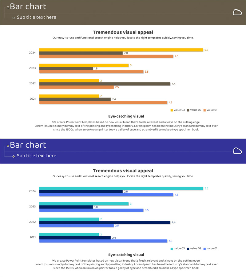
A horizontal bar chart PowerPoint slide comparing competitor performance across four years (2021–2024) with three data series. Two color scheme options are provided: warm tones (brown, orange, yellow) and cool tones (navy, teal, dark blue), each with clearly labeled data points. This presentation template is optimized for market analysis and competitive positioning in business reports, marketing strategies, and investor pitches. Delivered in 16:9 widescreen PPTX format, fully editable with instant chart updates upon data entry.
Usage Points
-
Main Usage
Visualizes competitor performance trends across four years with three simultaneous data series, clearly showing relative market position and competitive dynamics. Serves as a core chart in business plans, marketing strategies, and investor pitch decks for competitive environment analysis sections.
-
How to Use
Input year-by-year (2021–2024) values for three data series, and horizontal bars automatically generate. Choose between warm (brown, orange, yellow) or cool (navy, teal, dark blue) color palettes. Data labels and legend enable precise comparison. Customize colors and fonts to match presentation style.
-
Recommended For
Strategy and planning teams, marketing departments, and sales teams presenting competitive analysis; executive reports on market conditions; investor presentations analyzing competitive landscape; consulting reports with benchmarking data visualization.
-
Slide Structure
Two-slide layout. First slide features warm-tone horizontal bar chart (brown, orange, yellow) displaying 4 years × 3 data series; second slide mirrors the structure in cool tones (navy, teal, dark blue). Numeric labels appear at bar ends with legend positioned at bottom of each slide.
Related Products
-

Mobile App Usage Analysis Graph – Insights for Competitor Analysis
#Market and Competitor Analysis #Graph #Competitor Analysis
-

Social Network Business Market Analysis Chart – Effective Data Visualization
#Market and Competitor Analysis #Graph #Competitor Analysis
-

Science Market Analysis Bundled Bar Graph
#Market and Competitor Analysis #Graph #Competitor Analysis
-

Comparative Analysis Bar Graph – Data-Driven Market Insights
#Market and Competitor Analysis #Graph #Competitor Analysis
