Mixed Bar Graph for Market Analysis – Trends and Opportunities
RJ0300093_9
- Last Update 05/15/2025
- File Size 0.1MB
- # of Slides 2
- File Format PPTX
- Slide Ratio 16:9
- Color
Keywords
About the Product
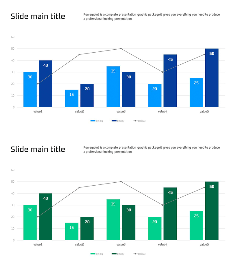
A mixed bar chart PowerPoint slide optimized for market analysis and competitive benchmarking. This slide combines light blue and dark blue bar series with a gray line graph to visualize three data dimensions simultaneously across five value categories. Each bar displays numeric labels for precise data communication, while the line overlay shows trend progression. The 16:9 widescreen PPTX format is fully editable and ready to use in presentations on market conditions, trend analysis, and business opportunities. Perfect for comparing multiple competitors or market segments while highlighting period-over-period changes.
Usage Points
-
Main Usage
This slide enables clear comparison of multiple competitors or market segments in a single view while displaying period-over-period trends. The combination of bar and line graphs presents both absolute values and trajectory changes, strengthening the analytical foundation for strategic decisions.
-
How to Use
Use this slide for market condition analysis, competitive benchmarking, quarterly or annual performance comparisons, and opportunity assessment presentations. Edit the title area with your analysis topic, update the legend and axis labels, then modify the data values. The color scheme is pre-applied, so you can insert it directly into your presentation without additional design work.
-
Recommended For
Marketing professionals, business planning teams, executives preparing reports, market research analysts, and investor relations specialists. Particularly effective for quantitative market opportunity identification, competitive strategy development, and business performance presentations.
-
Slide Structure
The slide features a title area at the top and a chart area below. The chart displays five items with light blue bars (period1), dark blue bars (period2), and a gray trend line (period3). Numeric labels appear on each data point, with a legend and Y-axis scale included for easy data interpretation.
Related Products
-

Area Graph & Notebook Mockup for Market Trend Analysis
#Market and Competitor Analysis #Graph #Other
-

Core Technologies of AI Chipsets: Performance Characteristics
#Market and Competitor Analysis #Diagram #Graph
-

Modern Blue Presentation Area Chart - Optimized for Market Analysis
#Market and Competitor Analysis #Graph #Other
-

Market Trend Analysis Area Graph – Market and Competitive Analysis
#Company Introduction #Market and Competitor Analysis #Graph
