Business Statistics Analysis Table – Visualizing Financial Performance
RJ0300083_28
- Last Update 05/12/2025
- File Size 4MB
- # of Slides 2
- File Format PPTX
- Slide Ratio 16:9
- Color
Keywords
- #Content-Based Slides
- #Design-Based Slides
- #Financial Plans and Performance
- #Diagram
- #Income Statement
- #Sales and Revenue
- #Table
- #16:9
- #financial analysis table PPT
- #statistics analysis PowerPoint slide
- #financial performance metrics
- #business data visualization slide
- #income statement presentation template
About the Product
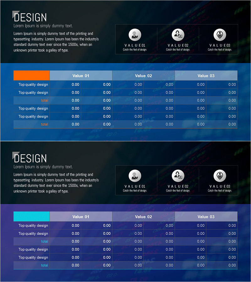
A business statistics analysis PowerPoint slide that visualizes financial performance through side-by-side metric comparison. Featuring a dark blue background with orange accent bars, this 2-slide set combines three VALUE indicator zones at the top with a multi-row data table below, enabling clear presentation of financial figures. Ideal for financial reports, performance reviews, and investment presentations, with ample text and numeric input areas to accommodate diverse financial datasets. Provided in 16:9 widescreen PPTX format for seamless integration into any presentation workflow.
Usage Points
-
Main Usage
Transforms financial figures and performance metrics into a structured table format, delivering clear financial information to decision-makers and investors. The two-tier information architecture—with VALUE indicators at the top and detailed data table below—maximizes readability and impact.
-
How to Use
Deploy in investor relations materials, financial reports, and business performance presentations to compare quarterly or annual financial metrics. Input core KPIs (revenue, profit, growth rate) in the three VALUE fields and populate the table with line-item details to create a multi-layered financial narrative.
-
Recommended For
CFOs, finance managers, and executives presenting quarterly earnings, shareholder meetings, and investor briefings. Also suitable for business plans and financial forecasting documents where target metrics are compared against actual performance.
-
Slide Structure
Two-slide layout with consistent structure: header area (title and descriptive text), VALUE zone (three metric icons, labels, and figures), and data table (row labels plus six-column numeric grid). Orange accent bars and blue background create clear visual hierarchy for data interpretation.
Related Products
-

Sales and Profit Table – Clear Visualization of Financial Planning
#Financial Plans and Performance #Diagram #Other
-

Affiliate Business Income Statement – Visualizing Financial Performance
#Financial Plans and Performance #Diagram #Income Statement
-

Sales and Bills Slide for Navigation App
#Financial Plans and Performance #Diagram #Income Statement
-

Income Statement Table – Clear Visualization of Financial Performance
#Financial Plans and Performance #Diagram #Income Statement
