Competitor Analysis Area Graph – Gaining Market Advantage
RJ0300082_27
- Last Update 05/12/2025
- File Size 0.1MB
- # of Slides 2
- File Format PPTX
- Slide Ratio 16:9
- Color
Keywords
About the Product
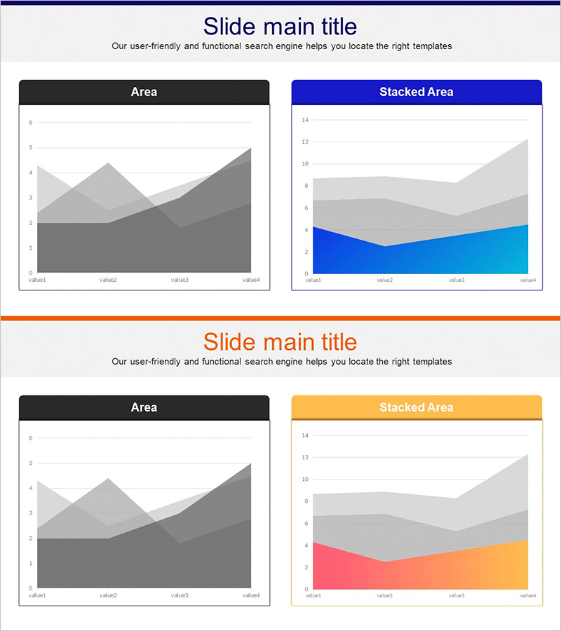
A two-slide PowerPoint presentation featuring area charts designed for market analysis and competitive positioning. The first slide displays a dark gray monochromatic area chart, while the second presents a stacked area chart in blue, light blue, and gray tones. Each slide includes a title and subtitle section with four data points (value1–value4) along the X-axis. This slide deck effectively visualizes multi-layered data such as competitor market share, market trends, and growth rate comparisons, making it ideal for strategic presentations and competitive intelligence reports.
Usage Points
-
Main Usage
Visualize multi-dimensional competitive data—such as market share, market trends, and growth rates—using area charts to clearly communicate competitive positioning and market advantage. Ideal for investor presentations, strategy meetings, and market analysis reports where stakeholders need to quickly grasp the competitive landscape.
-
How to Use
Enter your competitive analysis title and subtitle, then replace the chart data values with actual market figures. Use the dark gray version for simple comparisons and the stacked blue version for cumulative trend analysis. Customize the legend and axis labels to match your specific market data.
-
Recommended For
Marketing managers, strategic planning teams, and sales executives presenting competitive analysis to executives, investors, and partners. Perfect for business plans, investor pitch decks, market analysis reports, and corporate strategy presentations.
-
Slide Structure
Two-slide layout. Each slide contains a title and subtitle area at the top, a central area chart displaying four data points, and a legend section. The first slide features a grayscale area chart for simple comparisons; the second uses a three-color stacked area chart (blue, light blue, gray) for layered data representation.
Related Products
-

Carbon Neutral Competitive Advantage Horizontal Chart
#Market and Competitor Analysis #Graph #Competitor Analysis
-

Competitive Comparison Analysis Bar Graph – Visualizing Market Advantage
#Market and Competitor Analysis #Graph #Competitor Analysis
-

Doughnut Chart Presentation for Pet Store Competitor Analysis
#Market and Competitor Analysis #Graph #Competitor Analysis
-

Competitor Comparison Line Graph
#Market and Competitor Analysis #Graph #Competitor Analysis
