Analyzing 2 Comparison Graphs - Slides for Deriving Competitive Advantage
RJ0600012_19
- Last Update 06/24/2025
- File Size 0.3MB
- # of Slides 2
- File Format PPTX
- Slide Ratio 16:9
- Color
Keywords
- #Content-Based Slides
- #Design-Based Slides
- #Market and Competitor Analysis
- #Graph
- #Competitor Analysis
- #Competitive Advantage
- #Column
- #Line
- #Grouped Column
- #Line Chart
- #16:9
- #line chart PowerPoint
- #bar graph presentation slide
- #comparison analysis chart
- #competitive analysis slide
- #market analysis graph
About the Product
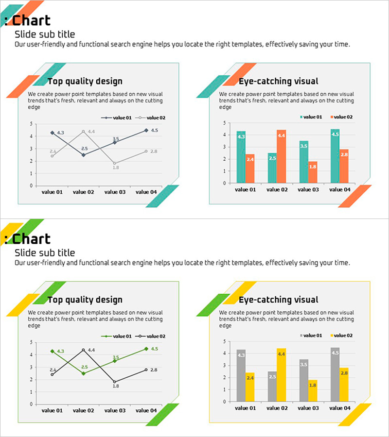
A two-slide PowerPoint presentation combining line graph and horizontal bar chart to compare two data series across four items. The left slide displays trend changes using a line chart with two data series, while the right slide shows the same items as horizontal bars for direct value comparison. Teal and orange accent colors clearly distinguish the two data series, with diagonal banner headers on each slide for section emphasis. Ready-to-use presentation slides for competitive analysis, market comparison, and performance evaluation reports.
Usage Points
-
Main Usage
Visualize quantitative data trends and numerical comparisons simultaneously to demonstrate competitive advantage, market positioning, and performance improvement. The line chart shows change over time while the bar graph emphasizes absolute value comparisons across items, providing multi-faceted analytical evidence.
-
How to Use
Insert into the market analysis or competitive analysis section of executive reports, business plans, or marketing proposals. Enter quarterly or monthly trend data into the left line chart and final values into the right bar graph. Modify legend labels and axis titles to match your data for immediate use.
-
Recommended For
Recommended for executives, business managers, marketing strategists, financial analysts, and consultants who drive decisions based on quantitative data. Particularly effective for competitive benchmarking, market share analysis, product performance evaluation, and customer satisfaction trend presentations.
-
Slide Structure
Two-slide layout. Left slide: line chart with 4 items (value 01–04) and 2 data series, legend, and value labels. Right slide: horizontal bar chart with same 4 items and 2 data series, legend, and value labels. Each slide features teal and orange diagonal banner header for section emphasis. 16:9 widescreen format, PPTX file.
Related Products
-

Market Insights Through Competition Analysis Chart – Gaining Competitive Edge
#Market and Competitor Analysis #Graph #Competitor Analysis
-

Broken Line Comparison Graph – Optimized for Market and Competitor Analysis
#Market and Competitor Analysis #Graph #Competitor Analysis
-

Competition Graphs and Analysis – Slides for Market Advantage
#Market and Competitor Analysis #Graph #Competitor Analysis
-

Competitor Comparison Analysis Graph - Highlighting Competitive Advantage
#Market and Competitor Analysis #Graph #Competitor Analysis
