Data Visualization Showcasing Continuous Growth Trends – Business Insights
RJ0300079_23
- Last Update 10/11/2025
- File Size 0.2MB
- # of Slides 2
- File Format PPTX
- Slide Ratio 16:9
- Color
Keywords
- #Content-Based Slides
- #Design-Based Slides
- #Market and Competitor Analysis
- #Graph
- #Competitor Analysis
- #Competitive Advantage
- #Line
- #Line Chart
- #16:9
- #line chart PowerPoint slide
- #multi-series trend analysis template
- #time-series data visualization
- #business performance dashboard
- #how to create line graph in PowerPoint
About the Product
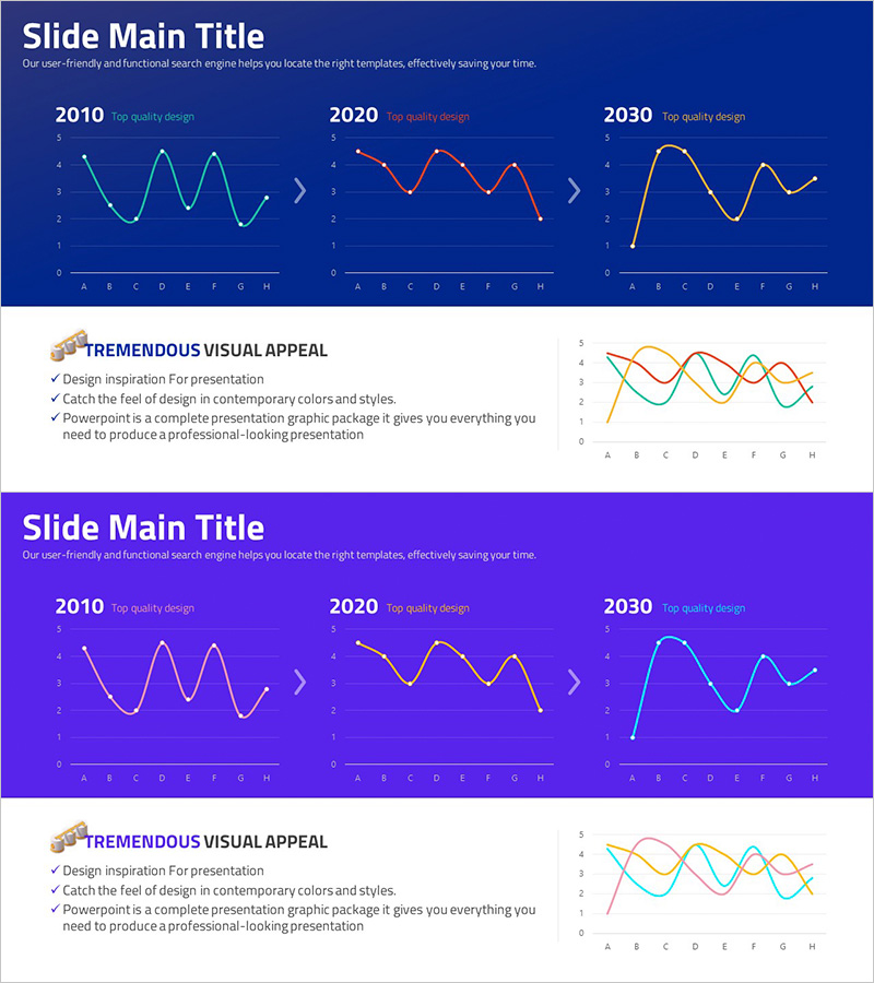
A professional line chart PowerPoint slide designed to visualize data trends across multiple time periods. This 2-slide template displays three distinct time points (2010, 2020, 2030) with three data series represented in contrasting colors (cyan, red, and yellow) against a dark blue background. Each chart contains 8 data points (A through H) showing temporal distribution patterns ideal for business growth analysis, market performance tracking, and comparative trend studies. The wide 16:9 PPTX format ensures compatibility across all presentation environments and supports immediate use in executive reports, quarterly reviews, and strategic planning presentations.
Usage Points
-
Main Usage
Designed to compare multiple data series simultaneously across time periods, enabling clear visualization of growth trajectories, market shifts, and performance metrics. Effectively communicates year-over-year changes, quarterly performance variations, competitive benchmarking, and financial trend analysis in executive presentations.
-
How to Use
Input your data values into each series and the line chart automatically renders the trends. Fully editable colors, line weights, and marker styles allow customization to match your brand. Add axis labels, legends, and annotations to enhance data clarity and audience comprehension.
-
Recommended For
Ideal for C-suite executives, business analysts, marketing managers, financial officers, and sales leaders presenting quarterly results, annual performance reviews, market analysis, investment pitches, and strategic planning sessions. Particularly effective for roles requiring data-driven decision-making presentations.
-
Slide Structure
2-slide deck featuring identical chart layouts with 3 time-point comparisons (2010, 2020, 2030). Each slide contains 3 color-coded data series with 8 data points (A-H) plotted on a Y-axis range of 0-5. Clear title area at top and legend at bottom provide information hierarchy and data interpretation support.
Related Products
-

Business Competitor Analysis Graph
#Market and Competitor Analysis #Graph #Competitor Analysis
-

Visualizing Menu Sales Status with Line Chart
#Market and Competitor Analysis #Graph #Competitor Analysis
-

Competitor Comparison Analysis Graph - Highlighting Competitive Advantage
#Market and Competitor Analysis #Graph #Competitor Analysis
-

Market Competitiveness Comparison Graph – Highlighting Competitive Advantage
#Market and Competitor Analysis #Graph #Competitor Analysis
