Visualizing Menu Sales Status with Line Chart
RJ0800003_27
- Last Update 07/31/2025
- File Size 0.6MB
- # of Slides 2
- File Format PPTX
- Slide Ratio 16:9
- Color
Keywords
About the Product
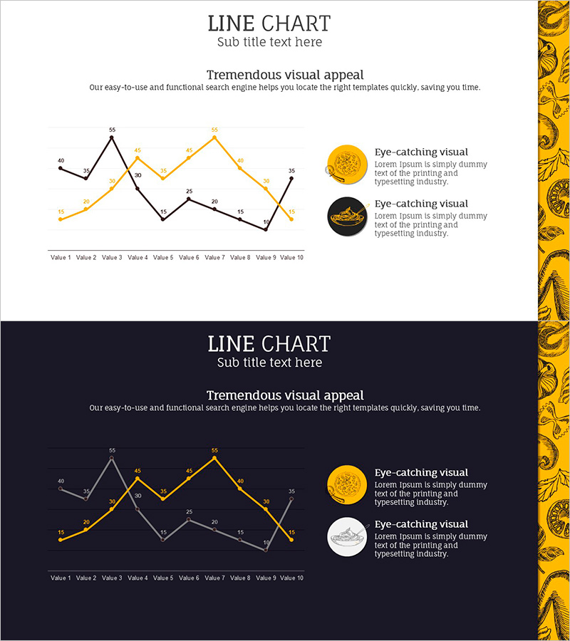
A dual-series line chart PowerPoint slide designed to compare menu sales performance and competitor trends over time. The slide visualizes 10 data points across two distinct series using contrasting gold and black lines, with numeric labels at each point for precise data communication. Two background versions—light and dark—are provided to adapt to different presentation environments. The chart clearly shows sales fluctuations, market movements, and competitive positioning, making it ideal for business reports, marketing analysis presentations, and quarterly performance reviews. All elements are fully editable to match your brand colors and data requirements.
Usage Points
-
Main Usage
Ideal for comparing two data series over time, such as sales performance versus competitor metrics, monthly revenue trends, or market share evolution. The numeric labels on each data point ensure accurate information delivery, while the contrasting line colors make series differentiation immediately clear to your audience.
-
How to Use
Replace the sample data with your own values in the chart area, and the graph updates automatically. Use the light background version for internal meetings and team reviews, and the dark background version for client presentations and formal events. Customize line colors, thickness, and legend text to match your presentation theme.
-
Recommended For
Financial analysts, marketing managers, sales directors, business intelligence professionals, and executives presenting quarterly results, product performance comparisons, customer acquisition trends, or market analysis reports.
-
Slide Structure
Two-slide set featuring identical chart layouts with different backgrounds. Each slide displays a dual-series line chart with 10 data points (Value 1 through Value 10), numeric labels, legend area, and annotation space. All chart elements are grouped for easy repositioning and resizing.
Related Products
-

Curved Gradient Line Graph – Market and Competitor Analysis
#Market and Competitor Analysis #Graph #Competitor Analysis
-

Competition Graphs and Analysis – Slides for Market Advantage
#Market and Competitor Analysis #Graph #Competitor Analysis
-

Visualizing Market Analysis with Line Chart – Harmony of Mint and Orange
#Market and Competitor Analysis #Diagram #Graph
-

Competitor Idea Analysis Graph
#Market and Competitor Analysis #Graph #Competitor Analysis
